Coming Frontline Portal redesign
During the first part of 2025 we will be working with updating the look of our Frontline Portal with a brand new design. This new design will be released in phases. Important to note is that we will not be changing any functionality - only the look and feel. Below are the phases we are currently planning to deliver the new design in and some examples of how this will look (this is subject to change):
Release 1:
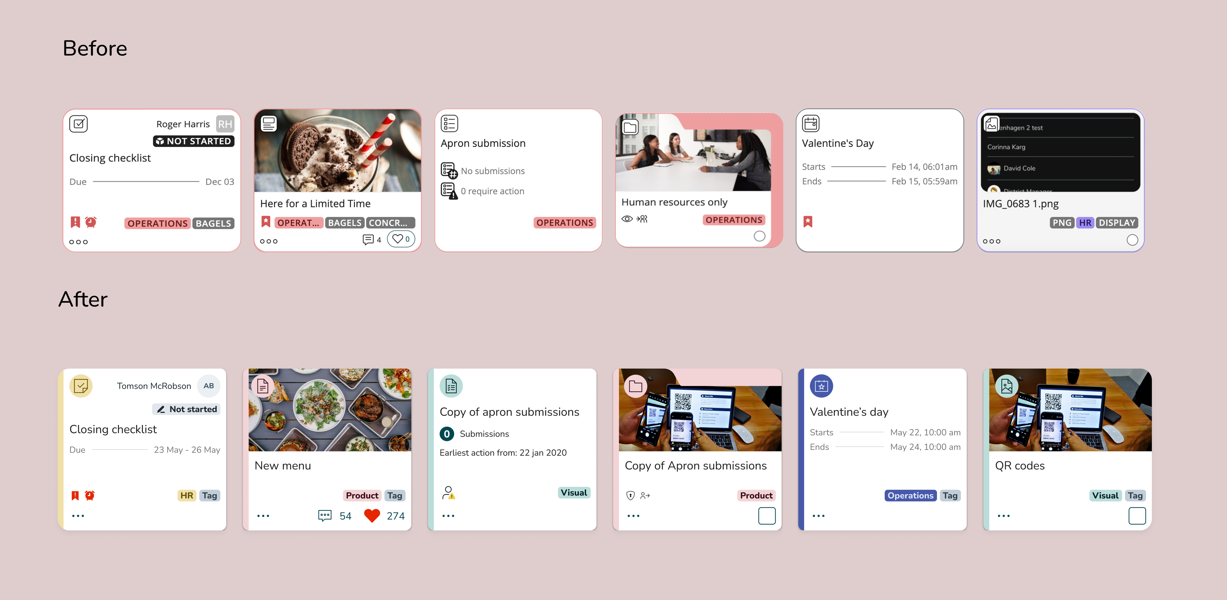
In this release we will be updating the cards for stories, tasks, files and folders & forms using our updated QUI library. The new design includes new icons, fonts, and colors, while maintaining the same functionality.
Release 2:
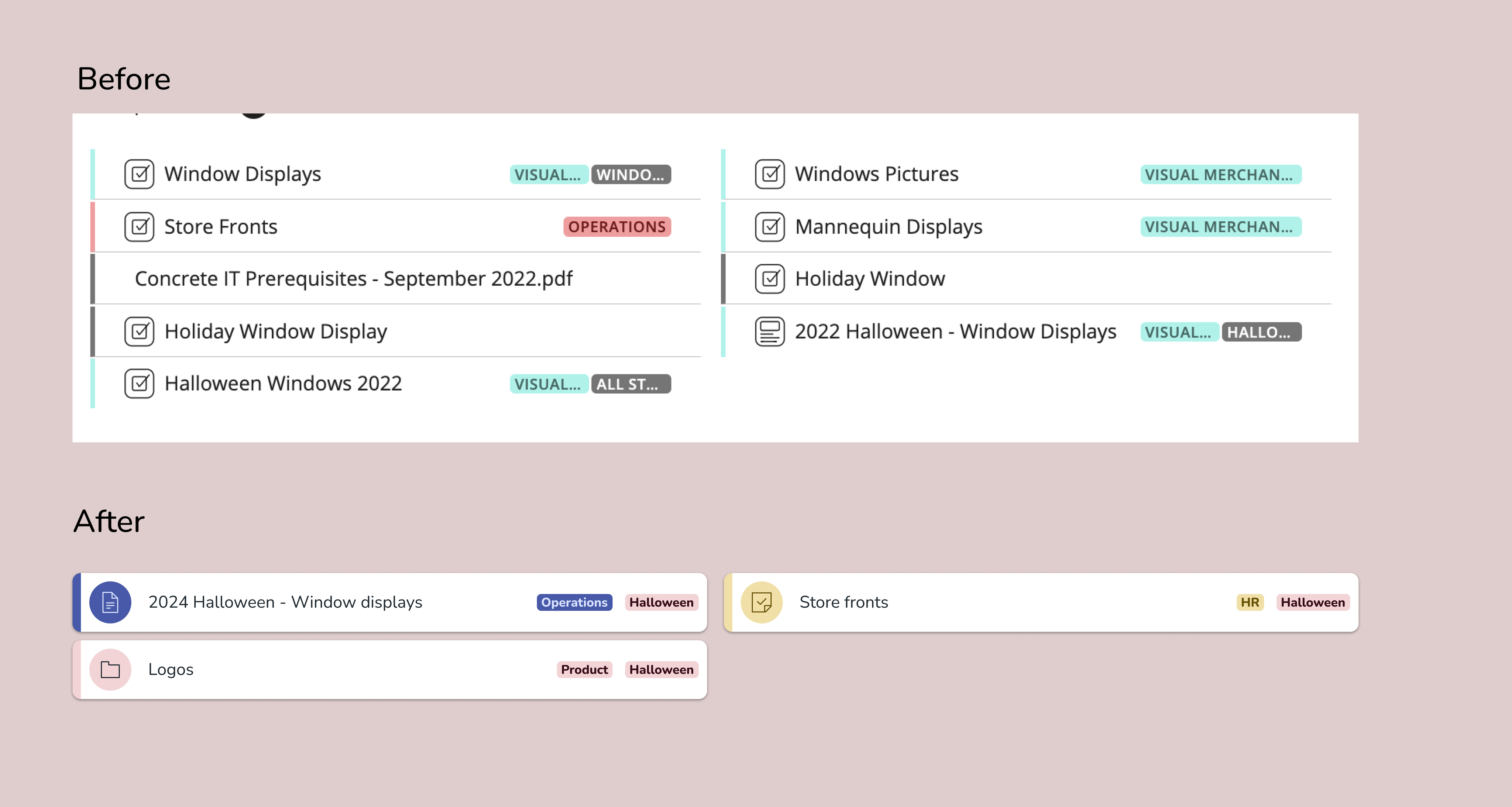
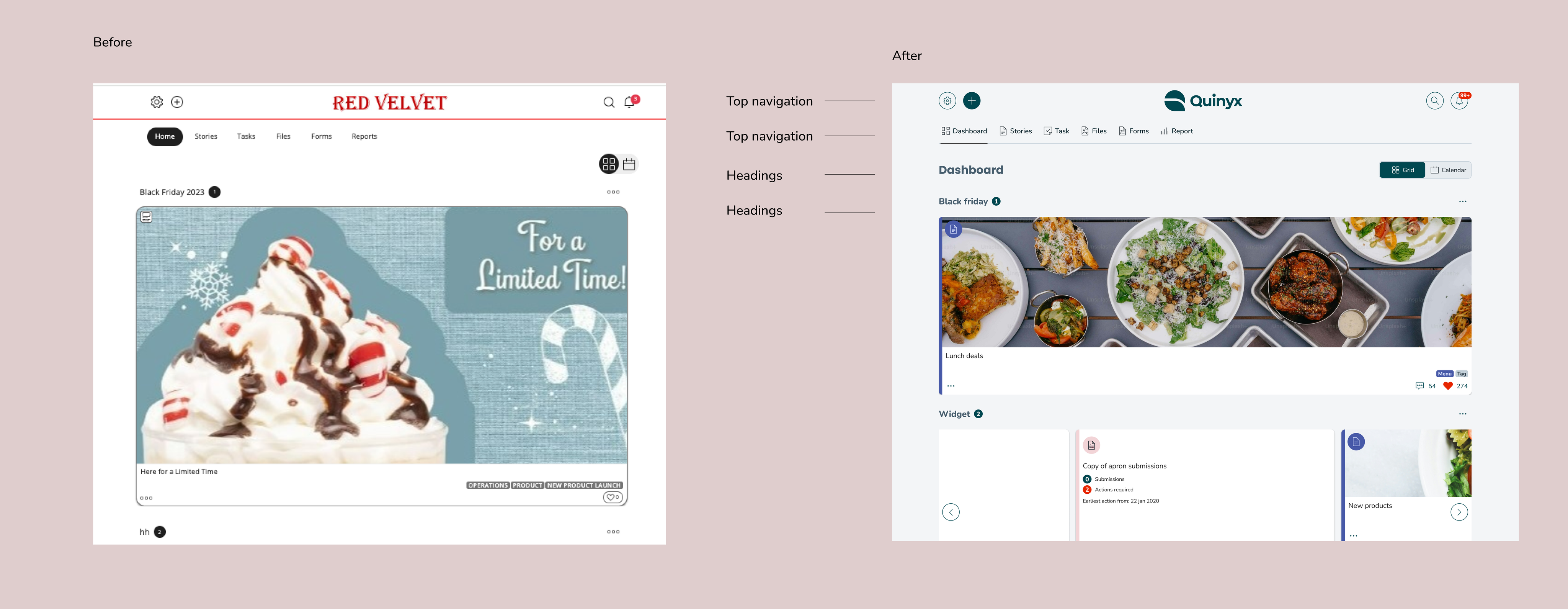
In this release we will be updating the “List” view in tasks, along with the top navigation and tabs for Dashboard, Stories, Tasks, and more. Additionally, we’re updating headings, such as those above the cards in the Dashboard.
List view

Heading and top navigation
Release 3:
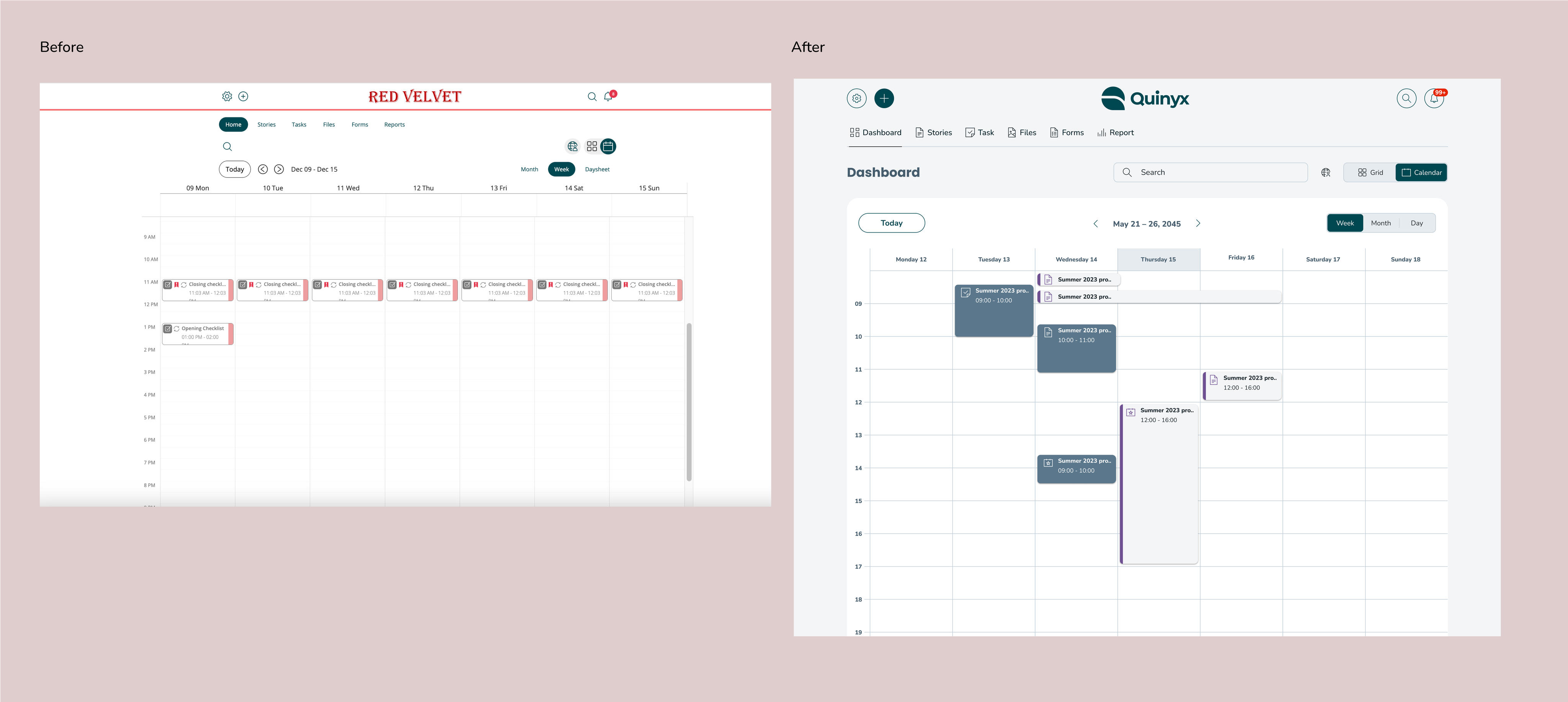
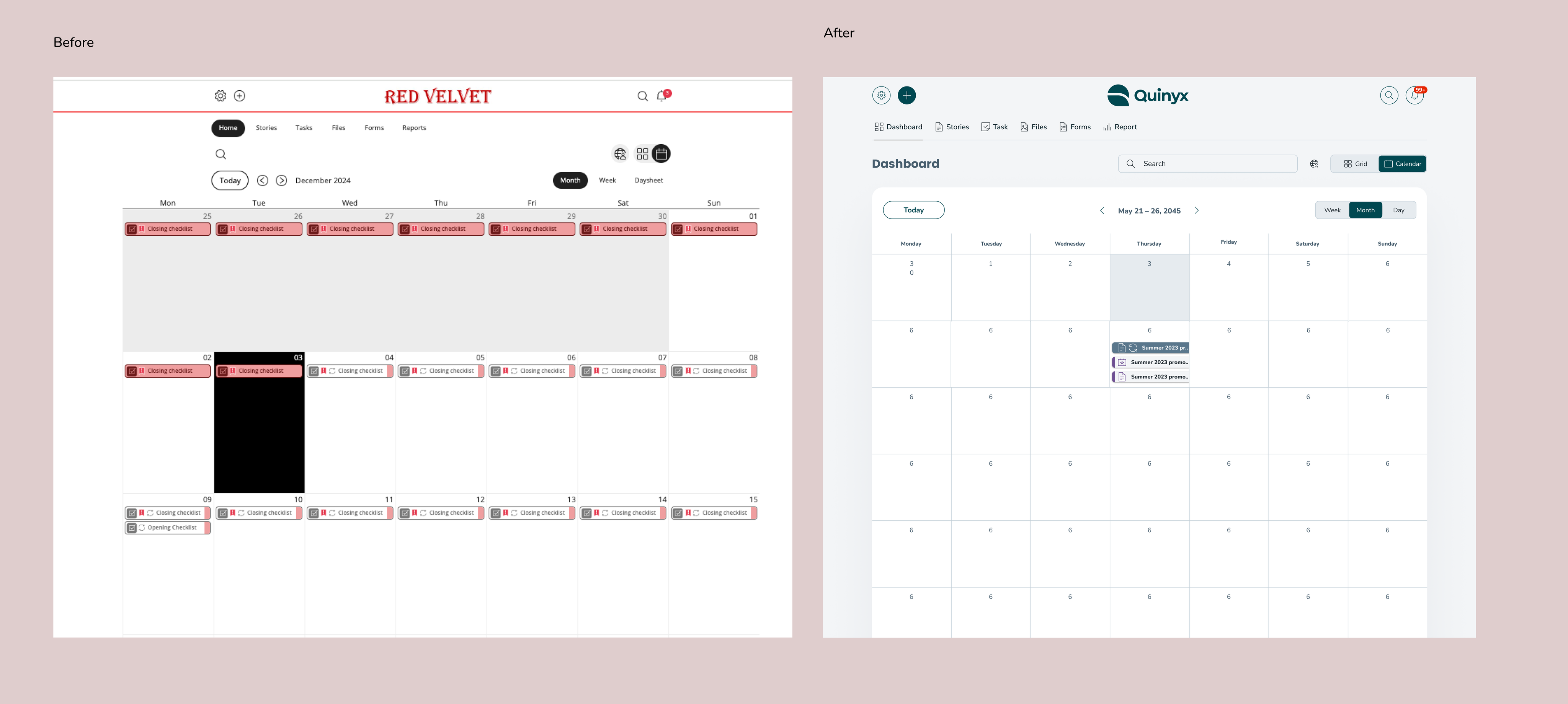
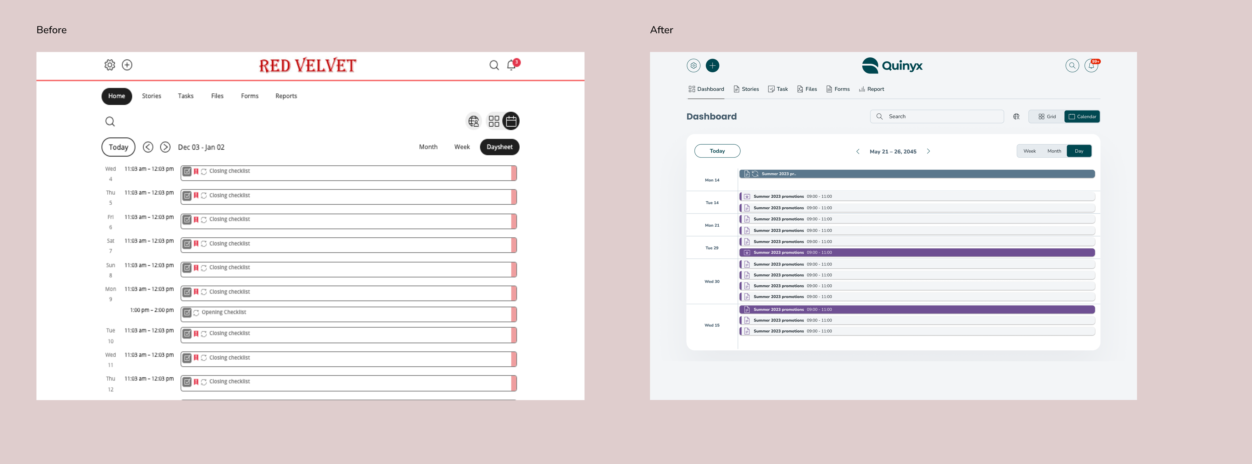
In this release we will be updating the calendar view - month, week and day sheet to incorporate the new colors, headings and icons, while also refreshing the design with a background border.
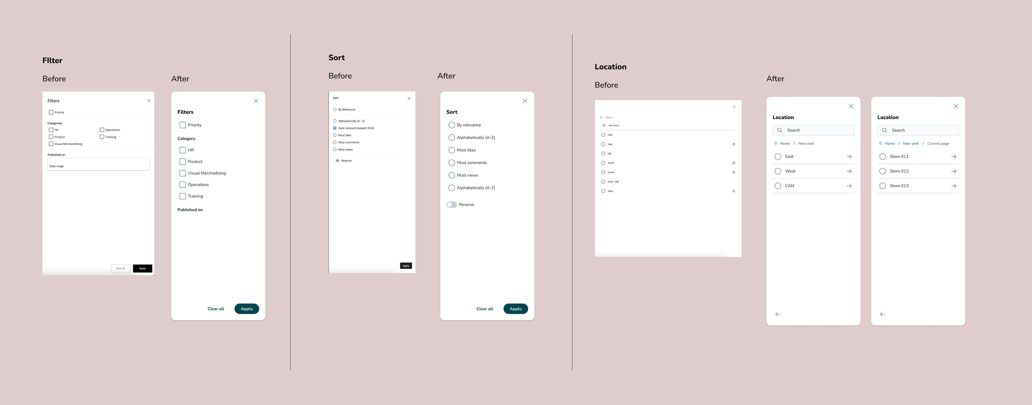
Additionally we are updating the side menus like “Filters, “Sort”, “Location” and so on.
Calendar Week
Calendar Month
Calendar Daysheet
Side menus before and after
Release 4:
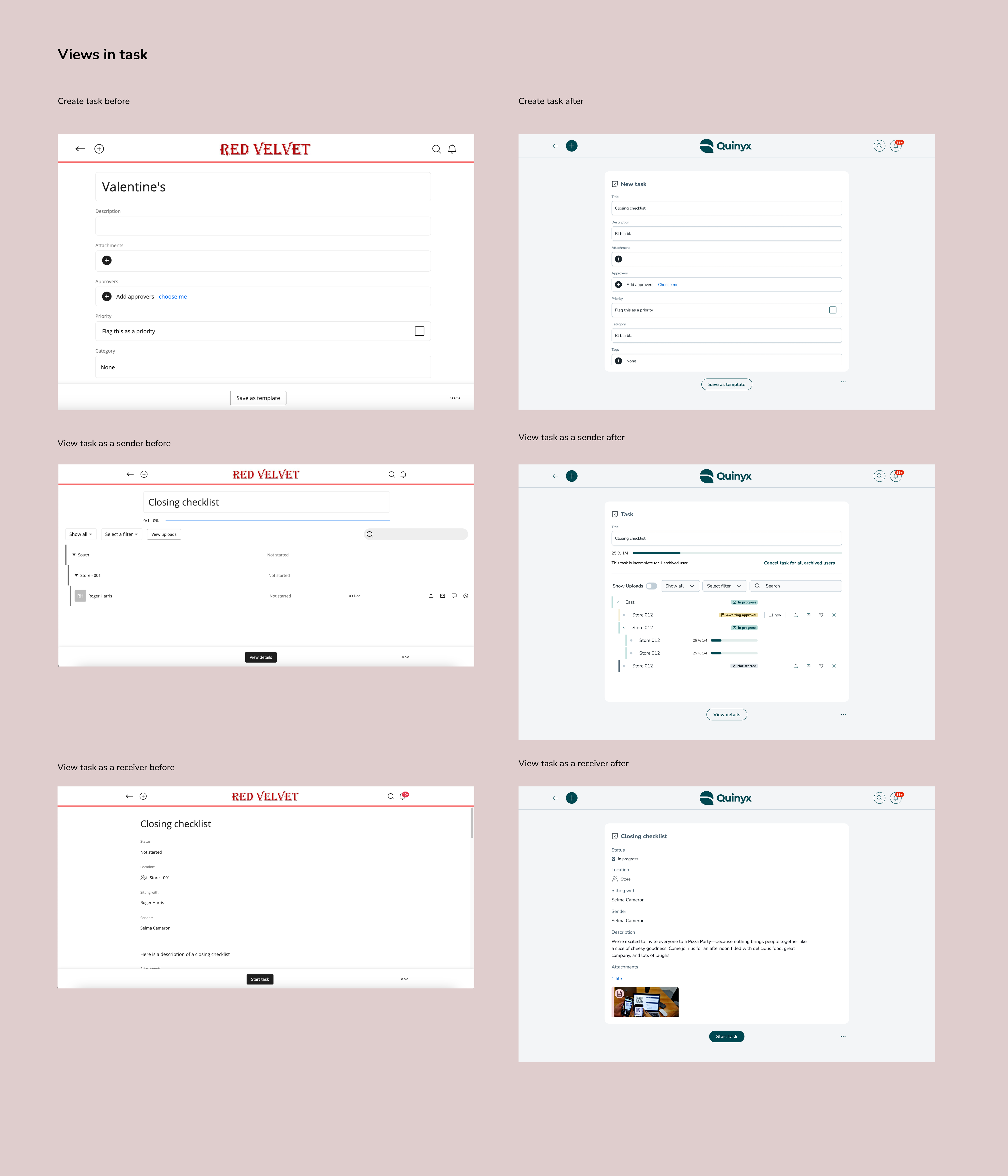
In this release we will be updating the resource views. Since all other pages in the Frontline Portal will include a heading along with either input fields or description fields from a receiver or sender, we are updating all the various resource views (task, story, forms, files and folders) in release 4.
Example of tasks:
Other views:
We are also updating all other views that have a smaller structure, with a heading, and some type of input field or list item. These views include
- Adding a widget
- Profile
- User managment
- Notification
- Saved audience


