Engagement dashboards
 Updated
by
Leigh Hutchens
Updated
by
Leigh Hutchens
Advanced Analytics refers to the use of sophisticated data analysis techniques and tools to extract insights and information from large and complex data sets. These techniques go beyond basic statistical analysis and can include methods such as data mining, predictive modeling, machine learning, artificial intelligence, and deep learning.
The purpose of advanced analytics is to uncover hidden patterns, relationships, and trends in data that may not be immediately apparent using traditional methods. This information can then be used to make data-driven decisions, optimize business operations, improve performance, and gain a competitive advantage.
Engagement dashboards
In the spirit of using Advanced Analytics to extract insights for your organization and employees, we've created the Pulse dashboard and the Badges dashboard. We designed these engagement dashboards with the tagline in mind: Always know how your workforce is doing with metrics that reflect their happiness.
These dashboards are built as a more accessible and actionable entry for you to become accustomed to Advanced Analytics and to understand how you can utilize it to help drive engagement within your organization.
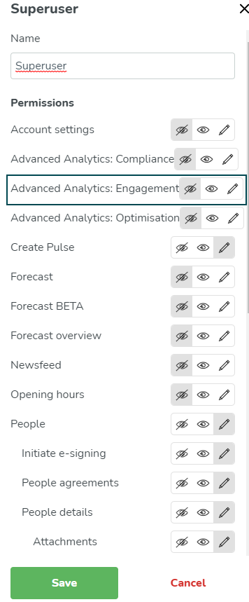
As with any module, you also need to enable Advanced Analytics: Engagement for the relevant roles in your organization for it to be visible. You can do this under Account settings > Role management.
Pulse dashboards 1.0
The Pulse dashboards are problem orientated so that you can easily take actionable insights and discern value from the dashboards from day one.
We structured the dashboards around three problems, or three sets of actionable insights:
- Are my managers using Pulse? (Who is sending pulses, and who isn't).
- Are employees engaging with Pulse? (The response rate per group or employee).
- Are there any trends in their answers? (How have their responses changed over time).
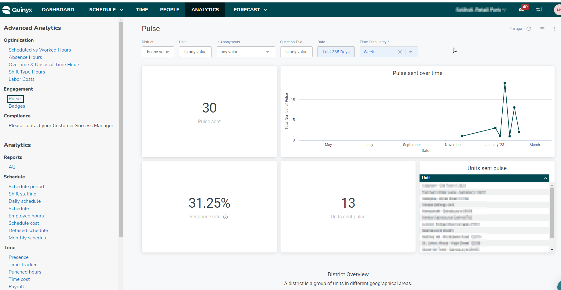
As a superuser, I can filter by time, group, or question to see:
- How many Pulses have been sent.
- The overall response rate for questions.
- The responses over time for a different question.
To view the Pulse dashboard:
Navigate to Analytics >Engagement > Pulse. You can select the following:
- District: Select one or multiple districts for which to view pulse information.
- Unit: Select one or multiple units for which to view pulse information.
- Is Anonymous: Select either anonymous or non-anonymous.
- Question Text: Select any or all of the questions that you've asked your employees.
- Date: You can select from preset increments of time, like today, yesterday, the past week, the past month, the past quarter, and so on. You can also customize the increments of time by using the date picker under Custom.
- Time Granularity: Select day, month, quarter, week, or year.
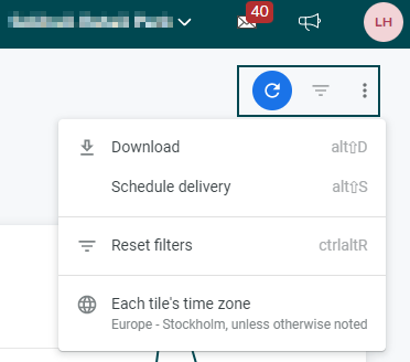
In the top right, you'll see three options, you can refresh the page, you can hide the filters you've selected, and you can choose to download, schedule delivery, reset the filters, and change the dashboard's time zone.
Badge dashboards 1.0
As with the Pulse dashboards, we followed the “three mantra approach”, where the problems we tried to answer with the dashboards were:
- Are my managers using badges? (Who is sending badges, and who is not).
- Are employees using badges? (Who is receiving badges, and who is not).
- Are there any additional trends? Is there any relationship between the sender and receivers (patterns in people sending back and forth, which badges are being sent when, etc.)?
As a superuser, I can filter by time, group, and badge type to see:
- Who has sent the most badges.
- Who has received the most badges.
- How the general usage (total sent) changes over time.
To view the Badges dashboard:
Navigate to Analytics >Engagement > Badges. You can select the following:
- District: Select one or multiple districts for which to view pulse information.
- Unit: Select one or multiple units for which to view pulse information.
- Title: You can select one or more badge types.
- Date: You can select from preset increments of time, like today, yesterday, the past week, the past month, the past quarter, and so on. You can also customize the increments of time by using the date picker under Custom.
- Time Granularity: Select day, month, quarter, week, or year.
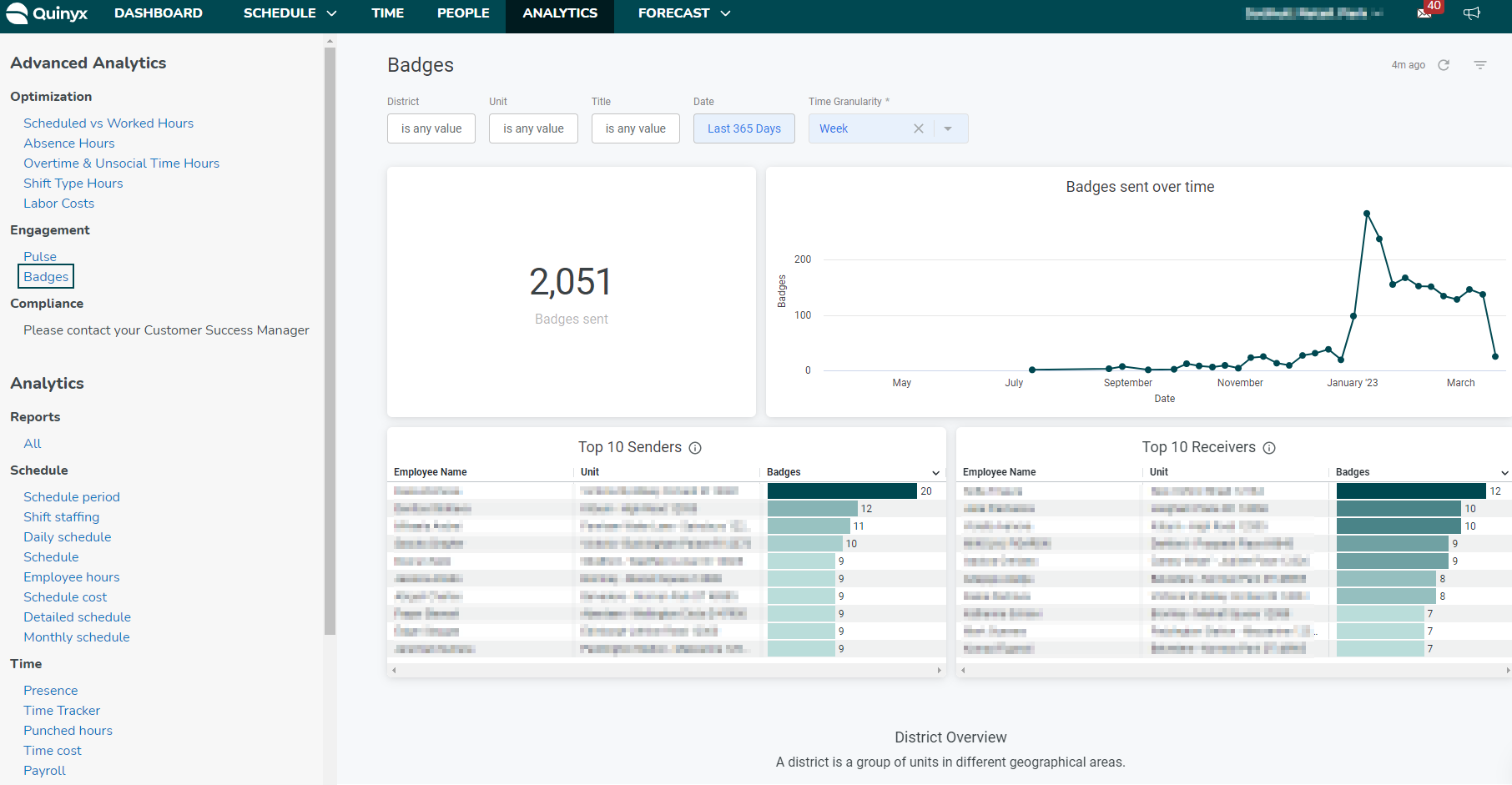
You'll be able to see the number of badges sent, badges sent over time, the top 10 senders, and the top 10 receivers.
In the top right, you'll see three options, you can refresh the page, you can hide the filters you've selected, and you can choose to download, schedule delivery, reset the filters, and you can change the dashboard's time zone.