Advanced Analytics
 Updated
by
Daniel Sjögren
Updated
by
Daniel Sjögren
Introduction
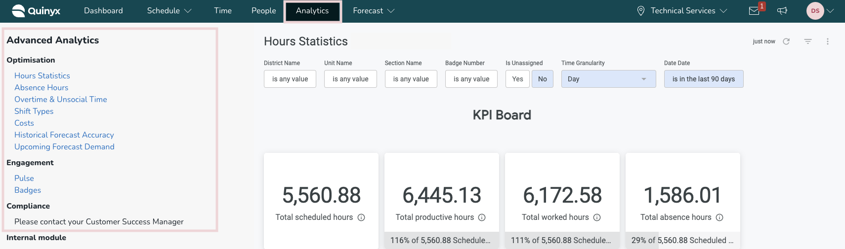
Advanced Analytics offers a set of dashboards for you to visualize and analyze your WFM-related data to see trends across your business. The dashboards are found under the Analytics tab within Quinyx:

To be able to access Advanced Analytics, you must have the Advanced Analytics module activated for your organization. If you are unable to see these dashboards, please contact your account representative.
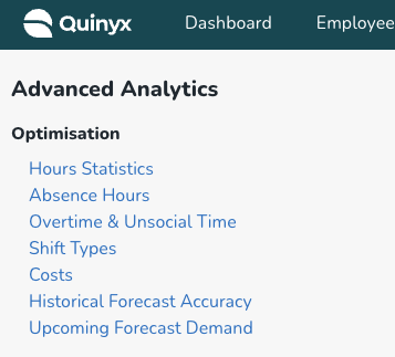
The dashboards are broken down into three main categories:
- Optimization: These dashboards are focused on core WFM metrics such as scheduling, absences, and costs.
- Compliance: These dashboards are focused on helping businesses check their compliance adherence. Read more about the Compliance Checker dashboards here.
- Engagement: These dashboards are focused on helping businesses understand the engagement level of their workforce. Read more about the Engagement dashboards here.
Before anyone can see any of the dashboards, you first need to enable permission for specific roles. See below.
Advanced Analytics Setup
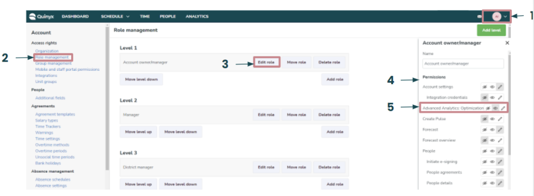
The dashboards are turned off by default. You can decide who can access the dashboards by enabling the permission for Advanced Analytics under each Role, found under Account Settings > Role Management > Edit Role.
Note that currently, there is no difference between read and write permissions, as all data presented in Advanced Analytics is read-only.
- Go to Account settings.
- Select Role management.
- For the selected role, click Edit role.
- This will open permissions, where you’ll be able to see Advanced Analytics modules: Optimization, Compliance & Engagement (Coming Soon!).
- Select the relevant module.
Once you’ve set permissions, go to the Analytics tab, and you should have the relevant module live:
KPI Definition
Optimization
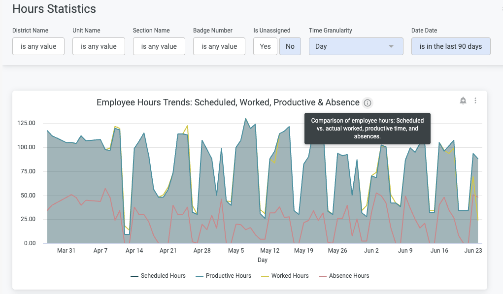
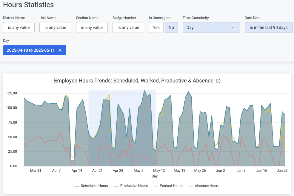
Hours Statistics
The "Scheduled vs Worked Hours" dashboard has been replaced with the new "Hours Statistics" dashboard!
Combining scheduled hours and worked hours with productive hours and absence hours, we're enabling rich interactive insights that also enable full organizational drill-downs with the inclusion of section and employee level granularity.
Overtime & Unsocial Time Hours
This dashboard is designed to give you an overall view on the usage of your overtime and unsocial time hours, with drilldowns available on a district, unit, section, or employee level.
Here, you can also differentiate between your standard and custom salary types (using the "Hour Type" filter) to differentiate between the use of each within your organization.
OT Codes: 1030, 1031, 1032, 1033, 1034, 1090, 1091, 1092, 1093, 1094, 1180, 1181, 1182, 1183, 1184, 1185, 1186, 1187, 1188, 1189, 1190, 1191, 1192, 1193, 1194, 1195
UT Codes: 1050, 1051, 1052, 1053, 1054, 1055, 1056, 1057, 1110, 1111, 1112, 1113, 1114, 1115, 1116, 1117, 1140, 1141, 1142, 1143, 1144, 1145, 1146, 1147, 1170, 1171, 1172, 1173, 1174, 1175, 1176, 1177, 1200, 1201, 1202, 1203, 1204, 1205, 1206, 1207, 1210, 1211, 1212, 1213, 1214, 1215, 1216, 1217, 1220, 1221, 1222, 1223, 1224, 1225, 1226, 1227
Custom Codes: Anything else you add yourself.
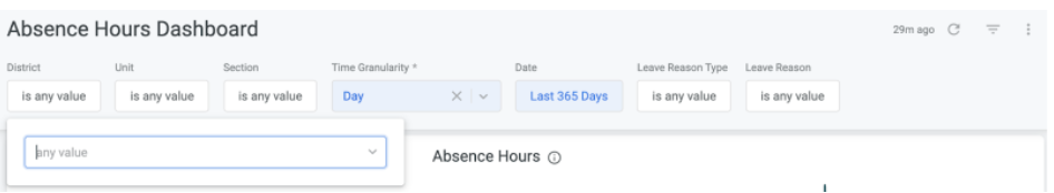
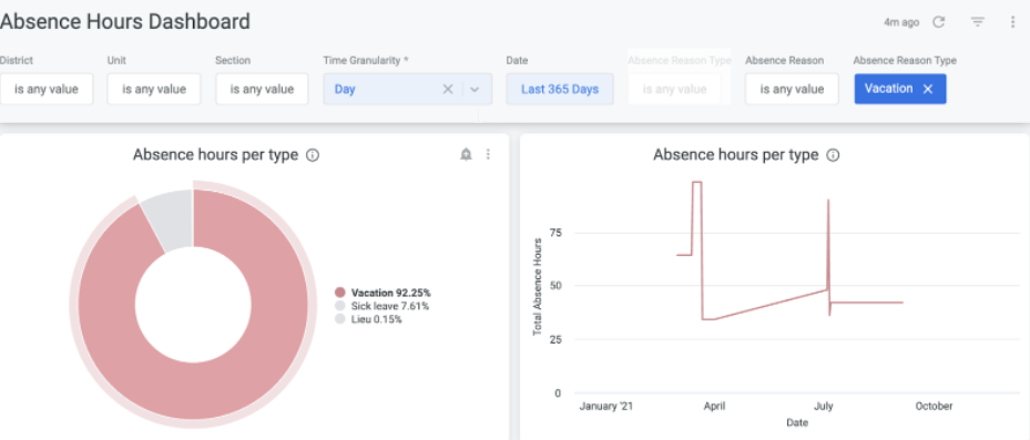
Absence Hours
Absence hours are calculated as the total number of absence hours from scheduled hours.
Shifts Type Hours
Total number of scheduled hours per shift type varied by customer business. For example, Store, Back Office, etc.
Labor Costs
Total labor costs from worked hours of employees, such as Monthly Salary, Overtime, Vacation, social costs, etc.
Upcoming Forecast Demand
The Upcoming forecast demand dashboard is designed to give you a clear and actionable forward looking visualization of projected demand over the next time period based on historical sales data from previous periods.
It offers an intuitive representation of the total number of items expected to be sold, allowing you to anticipate future trends and adjust your planning accordingly. In addition to providing an overview of expected demand, this dashboard also visualizes potential variances, making it easier to spot where actual outcomes may diverge from the forecast.
Historical Forecast Demand
The Historical forecast accuracy dashboard, likewise, is crafted to provide a clear and actionable visualization of your forecasting performance over past periods.
By comparing the forecasted demand with the actual demand, this dashboard enables you to assess how accurately your forecasts have aligned with real-world outcomes. It offers intuitive charts and metrics that showcase trends in forecasting accuracy, helping you understand whether your predictions are improving over time.
Compliance
Schedule
Number of violations: This will be a total count of violations that have been flagged.
Types of violations: This is a count of the different violations types that have occurred.
Using the dashboard
On the left side of the application, you can navigate between the various dashboards under each category by clicking on the blue links under the heading:
By default, the page will be loaded for the whole business, showing a visual summary of all districts and units in the widgets at the top of the page and a District and Unit overview further down the page. The data set is refreshed overnight to match what has occurred within Quinyx.
You will also find a set of contextual filters at the top of the page that will affect the entire dashboard, such as the ones below:
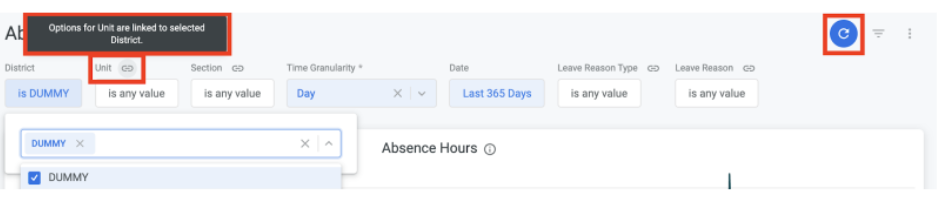
You can add a filter by clicking into the applicable filter box, typing to search or scrolling through the list of available options, and then ticking the checkbox beside the option you want to select. Once you add a filter, you will see a '"link" icon to highlight the fact that the selectable options in this filter option are restricted by the previous filter you have added.
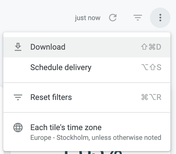
You need to click the refresh icon on the far right to reload the dashboard with the selected filters:
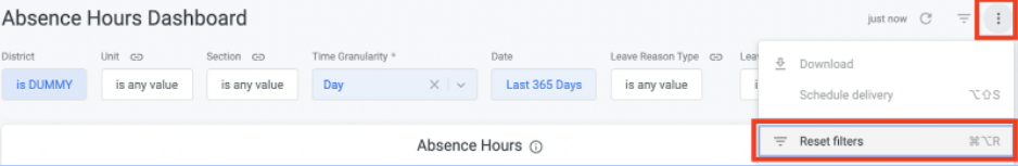
To remove filters, click on the ellipsis icon on the right right and select Reset filters:
Inside each widget, you will see an information icon. Hovering over this icon will display a definition of the selected metric to help you understand what the data represents:
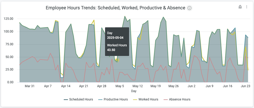
Hovering your mouse over the data inside the widget will also display a tooltip showing the details of that specific data point:
You can also click on particular data points inside relevant widgets to instantly apply a filter to the dashboard and add/remove that data point from the visualizations:
You can also drag and drop over a specific date range to update the dashboard to focus on the data in this specific timeframe:
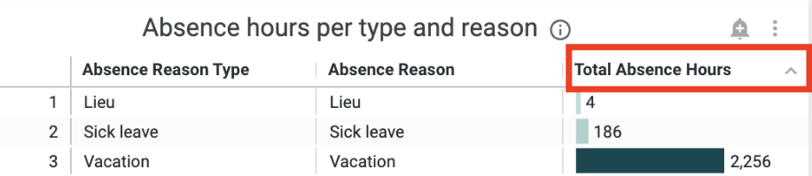
Data is also displayed in tables, and clicking on a table heading will change the sorting order inside the table:
Downloading Reports
There are two ways to download data from Advanced Analytics. You can download an entire dashboard, or just the data in a specific tile.
Downloading an entire dashboard
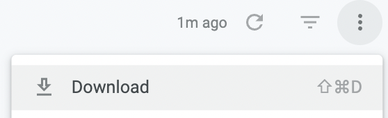
To download data from an entire dashboard, click the three dots at the top right of the screen and select Download.
This will open a new window allowing you to choose your download settings.
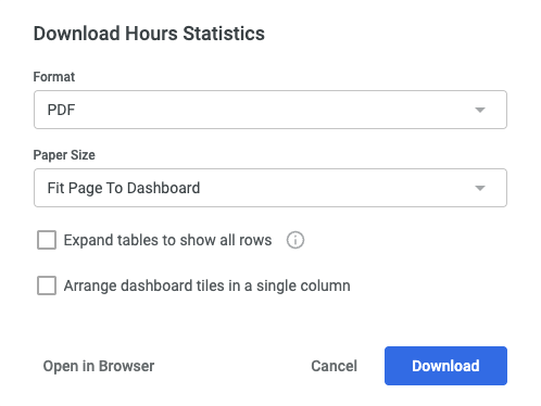
You can choose between a PDF and CSV file type and the paper size for ease of printing.
Expanding the tables to show all rows will ensure all data is shown, even on large tables that do not fit on the page.
Arranging dashboard tiles in a single column is also useful for ease of printing.
When you're ready to download the dashboard data, click Download. A new tab will open showing the status of the download and when ready, your file will be saved to your computer.
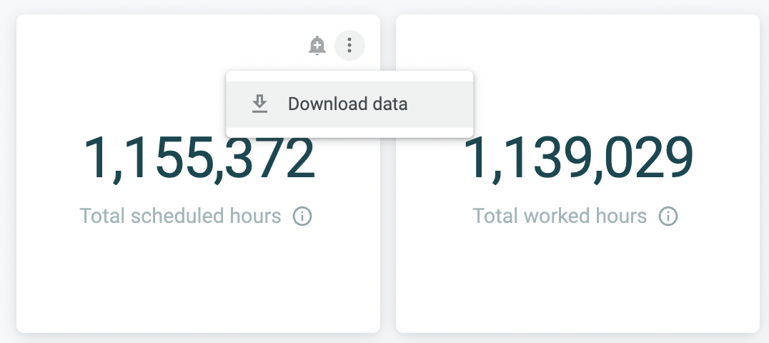
Downloading data from a single tile
To download data from a single title, click the three dots at the top right of the specific tile and select Download.
This will open a new window allowing you to choose your download settings.
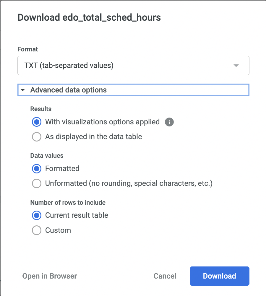
You can choose between different file types: TXT/Excel/ CSV/JSON/HTML/Markdown/PNG.
Under 'Advanced data options' you can also select various formatting types.
When you're ready to download the dashboard data, click Download. A new tab will open showing the status of the download and when ready, your file will be saved to your computer.
Scheduled Delivery
It is possible to set a schedule for when data from these dashboards is to be delivered to a particular place such as an email address.
To do this, click the three dots on the top right of the page and select Schedule Delivery
This is open a new window with options you can set relating to the frequency of the delivery, the destination and format.
Under Filters you can decide which parts of the report to deliver.
Under Advanced options you can add a custom message and adjust the page display options.
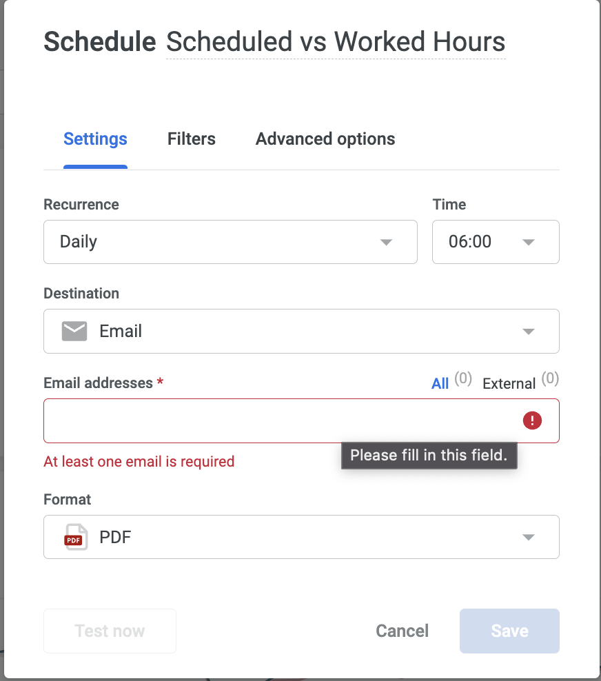
Once you have filled out your options and are ready to activate the schedule, click save.
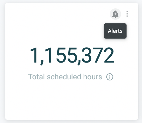
Alerts
Alerts can be set for specific data tiles to notify you when data thresholds are met.
To set an alert, hover over the tile on the dashboard and click the alert icon.
Note that alerts can be set only on tiles that have at least one numeric measure or table calculation in the tile’s visualization.
This will open a new window allowing you to configure options for the alert.
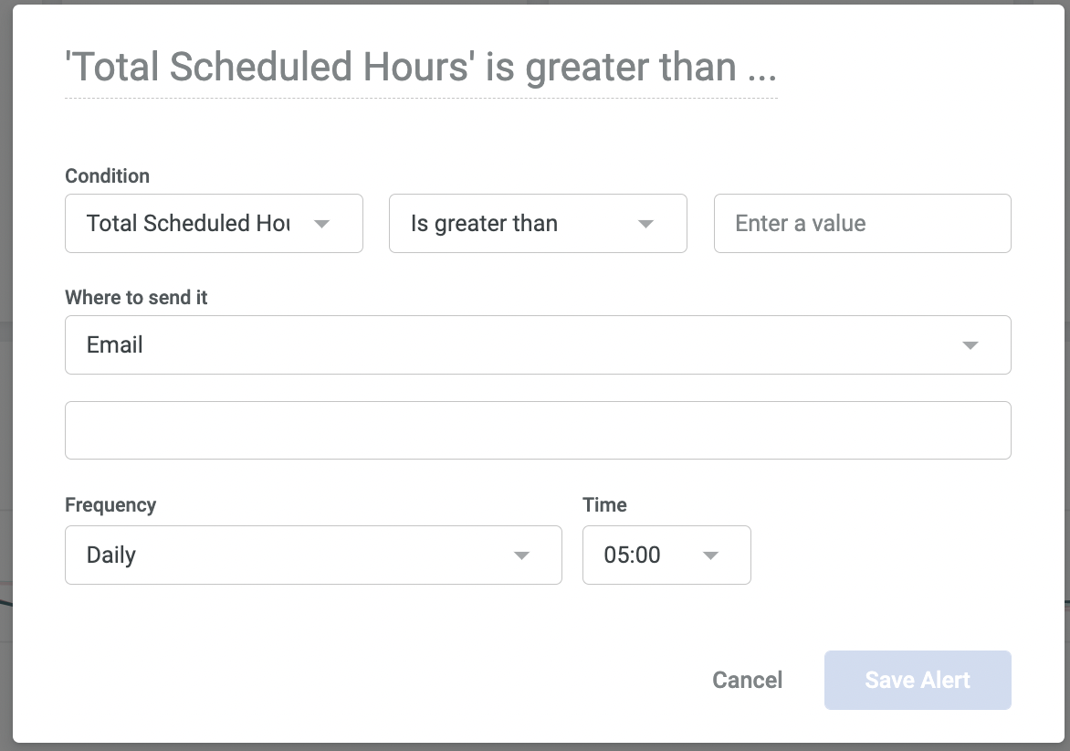
You can now set your conditions, options where to send the alert and the frequency.
Once you have clicked save, or if you already have scheduled deliveries setup, you will see a window similar to the one below:
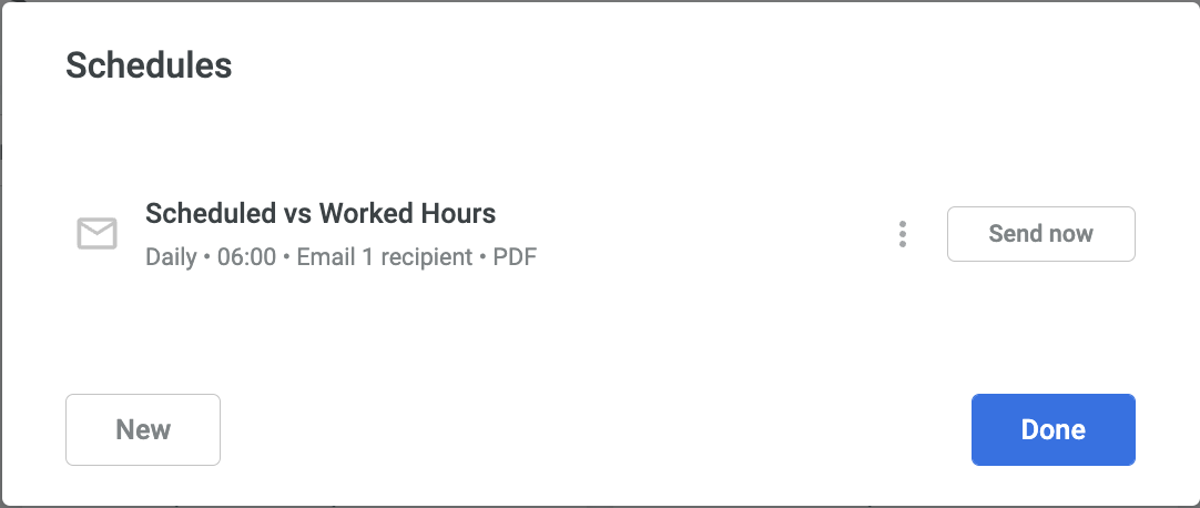
Clicking on the three dots will allow you to edit or delete the existing schedule.
Clicking Send now will send the report instantly.