Advanced Analytics - Historical forecast accuracy dashboard
Historical forecast accuracy
The Historical forecast accuracy dashboard is crafted to provide a clear and actionable visualization of your forecasting performance over past periods. By comparing the forecasted demand with the actual demand, this dashboard enables you to assess how accurately your forecasts have aligned with real-world outcomes. It offers intuitive charts and metrics that showcase trends in forecasting accuracy, helping you understand whether your predictions are improving over time.
One of the key features of this dashboard is its ability to help identify outliers—data points that significantly deviate from established trends. These outliers may signal an anomaly or a need for further investigation, providing actionable insights that can be addressed quickly. By pinpointing these exceptions, you can take proactive steps to refine your forecast models, reducing errors and improving the overall accuracy of your demand projections. This makes the dashboard not just a tool for monitoring forecasts but also a critical asset for enhancing predictive precision and driving more informed decision-making across your organization.
In terms of actionable insight, the Historical forecast accuracy dashboard serves as a vital tool for continuous improvement. It helps you monitor past forecasting performance and also equips you with the insights needed to make informed adjustments. This ensures that your demand planning becomes more accurate over time, driving better decision-making and operational efficiency across your organization.
Global controls and filters

Forecasted demand (Totals)

Insight | Description |
Total Forecasted Demand | The Total forecasted demand shows the aggregate total for your exact forecast based on the selected groups, variables, and time period. The Forecast range shows any potential variance from that total. Showing the lowest scenario and highest scenario (each calculated as 90% variance from the baseline). |
Forecasted Confidence Range | The Daily forecasted demand with likely range is a visual representation of this same information, illustrating how this is predicted to change over time. The center line shows the Forecast Total, while the north and south line shows the confidence intervals. That being the 90% confidence variance from that central line (5% above and 5% below). |
Forecasted demand (by variable)

Insight | Description |
Forecasted demand by variable | The Forecasted demand by variable panel uses this same data, but then slices it by variable. Designed as a table graph it provides a simple visualization of the high performers and low performers, organized by variable. |
Daily forecasted demand by variable | This line graph visualizes this Daily forecasted demand by variable over time. That is - showing the performance of each variable over time, to allow for easy comparison of the selected variables. |
Forecasted demand (by District and Unit)

Insight | Description | Details & Calculations |
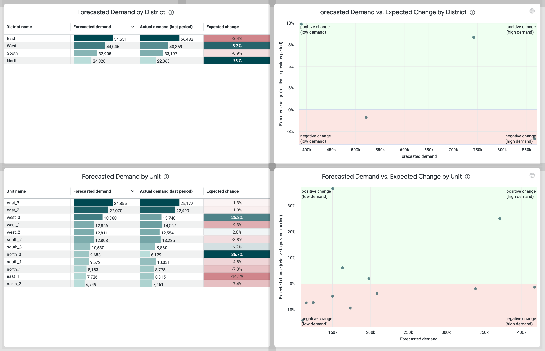
Forecasted demand by district | With the Forecasted demand by district and unit dashboards you get a simple view of all the groups within your organization to provide a comprehensive overview of how each district and unit is performing. | Everything here is clickable, so if you select any district or unit (in either the table or scatterplot graph the results will automatically be filtered to that group, allowing you to drill deeper to identify any discrepancies. |
Forecasted demand by unit | With the Forecasted demand by district and unit dashboards, you get a simple view of all the groups within your organization to provide a comprehensive overview of how each district and unit is performing. | Everything here is clickable, so if you select any district or unit (in either the table or scatterplot graph the results will automatically be filtered to that group, allowing you to drill deeper to identify any discrepancies. |
Forecasted demand and expected change by district | With the scatter plot graphs accompanying them, you can get a visual representation of this same insight. Designed to help you easily identify outliers, here you can quickly differentiate between top performers, bottom performers and any district or unit performing outside the norm so that you can take actionable insight where needed. | Everything here is clickable, so if you select any district or unit (in either the table or scatterplot graph the results will automatically be filtered to that group, allowing you to drill deeper to identify any discrepancies. |
Forecasted demand and expected change by unit | With the scatter plot graphs accompanying them, you can get a visual representation of this same insight. Designed to help you easily identify outliers, here you can quickly differentiate between top performers, bottom performers and any district or unit performing outside the norm so that you can take actionable insight where needed. | Everything here is clickable, so if you select any district or unit (in either the table or scatterplot graph the results will automatically be filtered to that group, allowing you to drill deeper to identify any discrepancies. |


