Forecast Overview
 Updated
by
Leigh Hutchens
Updated
by
Leigh Hutchens
The Forecast tab provides an overview of your historical and predicted data in both graphical and table format. You'll be able to see standard variables, calculated variables, and input data as long as they have been configured to display within the Forecast overview. You can do this under Optimization settings > Statistics > Variable settings. Your role must have permission to access account settings in order to change these settings.
You can also choose to compare data between units using the comparison mode.
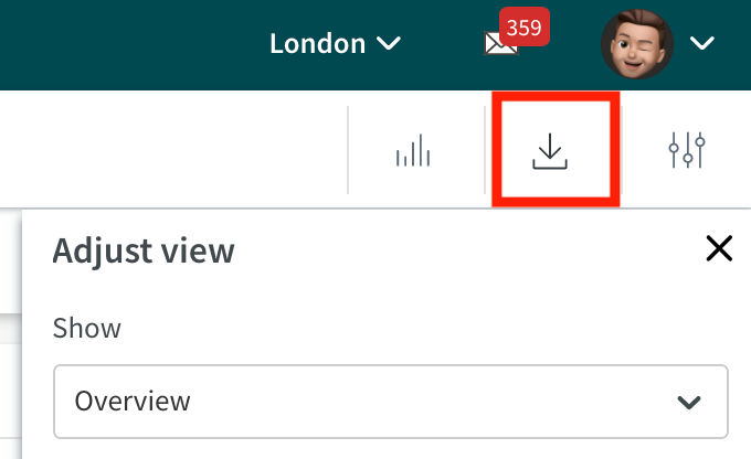
There are three buttons on the top toolbar: Toggle graph on/off, download (export) data, and Adjust view.
Overview mode
Overview mode is the default view of the Forecast Overview. This view will load each time you click on the Forecast tab. This view provides a view of the group you are currently logged in to, and the date range you choose to show and allows you to see standard variables, calculated variables, and input data in their display groups.
Overview mode is loaded by default when you click on the Forecast tab, but it can also be reverted to after switching to Compare mode by clicking on the Adjust View button, then selecting Overview from the Show drop-down list.
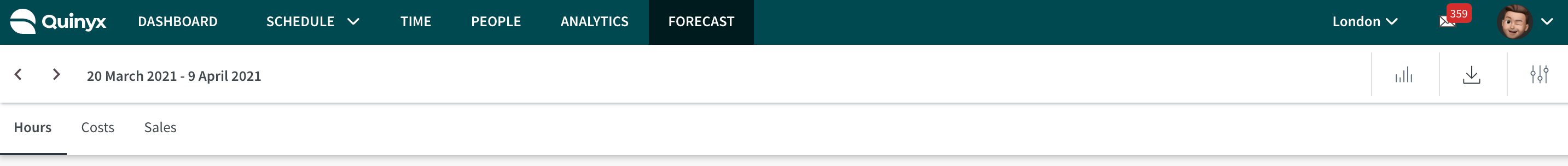
Viewing data
You can view data in the Forecast Overview at a Unit or Section level.
Along the toolbar under the date selector, you can find variables that have been grouped together using Display Groups.
In this example, we see the display groups Hours, Costs, and Sales.
The currently selected variable is identified with a bold line underneath it. In the above image, we can see Hours has been selected.
Below the list of display groups, you'll see the graph relating to the selected display group. Hovering your mouse over the graph will display details about the curves and their data. The list on the left of the graph shows all the data points available to show. You can show/hide a specific variable by clicking on its name in the graph.
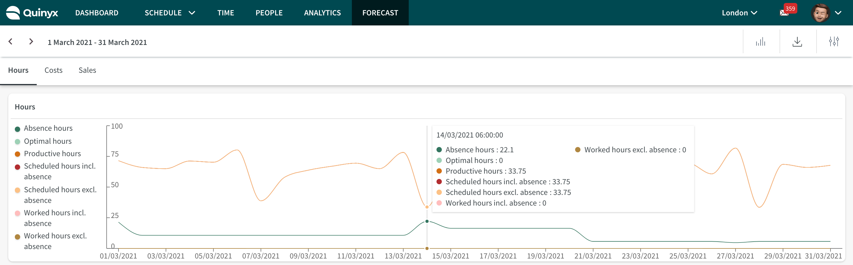
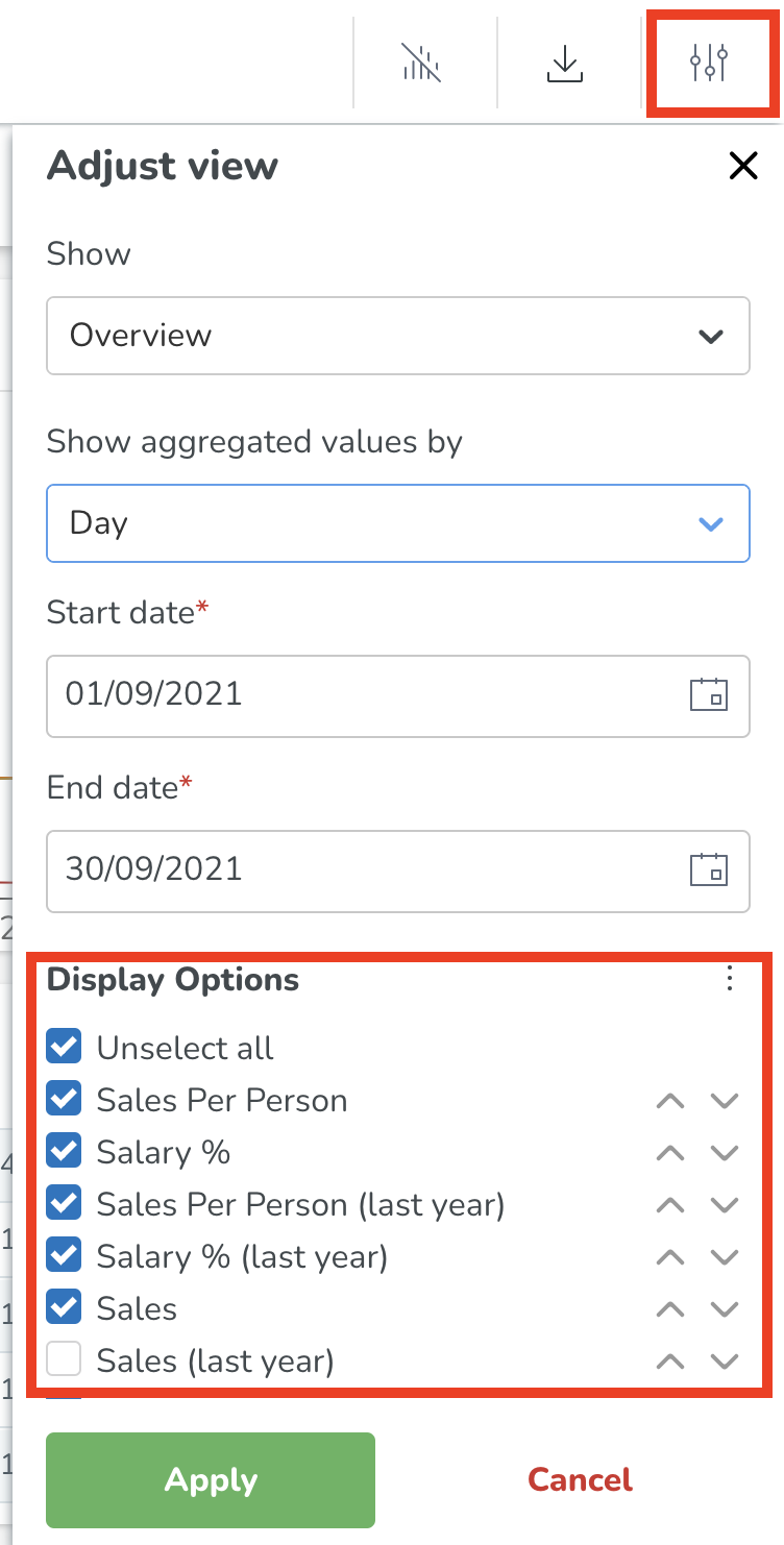
Clicking on the Adjust view button on the far right, you'll be able to select:
- What resolution to aggregate data at (hour, day, week, month)
- Date range
- Display Options - which data points and columns you wish to show/ hide.
Your settings will be remembered if you navigate away from the Forecast tab.
In the table itself, we can click the arrow beside each data aggregation point (day, week, month) to expand and drill down further. Currently, the lowest available resolution to show is hourly. Click the arrow again to roll the data back up.
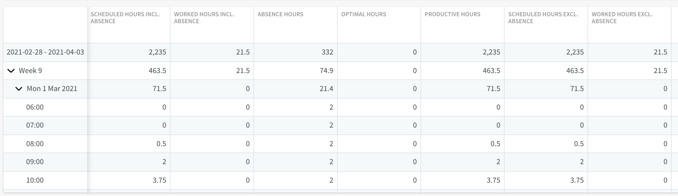
If you've chosen to view more columns than there is space on your screen to show, you can scroll using the arrow on the far right.
Viewing Forecast Data
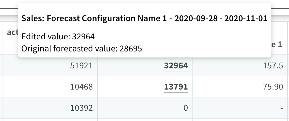
Similar to viewing forecast-related data in Statistics, any prediction that's been manually edited will display with a line underneath it. Hovering your mouse over this data point will show the original prediction and the current (edited) value.
Reordering columns and turning off/on data sets
By clicking on Adjust view and using the checkboxes, you can choose which data types to show. The available data types are defined by the variables in your display group. You can use the arrows to change the order of the columns in the table, or simply drag and drop them into the order you prefer.
Exporting data
It is possible to export a CSV file of the data currently being viewed on screen by clicking the download button in the top right.
Prior to Version 0206, when exporting forecast data, number and date fields were exported as strings. Now, they are exported in a more structured format, making it easier to import the data into external software without additional adjustments.
Numbers displayed inside the Forecast tab, and those that are generated on CSV exports from this tab, are formatted based on the language setting in Quinyx.
Using the number ten thousand as an example, numbers will display as:
- English GB 10,000.00
- English US 10,000.00
- English CA 10,000.00
- Svenska 10 000,00
- Norsk 10 000,00
- Suomi 10 000,00
- Dansk 10.000,00
- Deutsch 10.000,00
- Francais 10 000,00
- Francais CA 10 000,00
- Portuges 10.000,00
- Spanish 10.000,00
- Italiano 10.000,00
- Nederlands 10.000,00
- 汉语 10,000.00
- 日本語 10,000.00
- 한국어 10,000.00
- Русский 10 000,00
- Polski 10 000,00
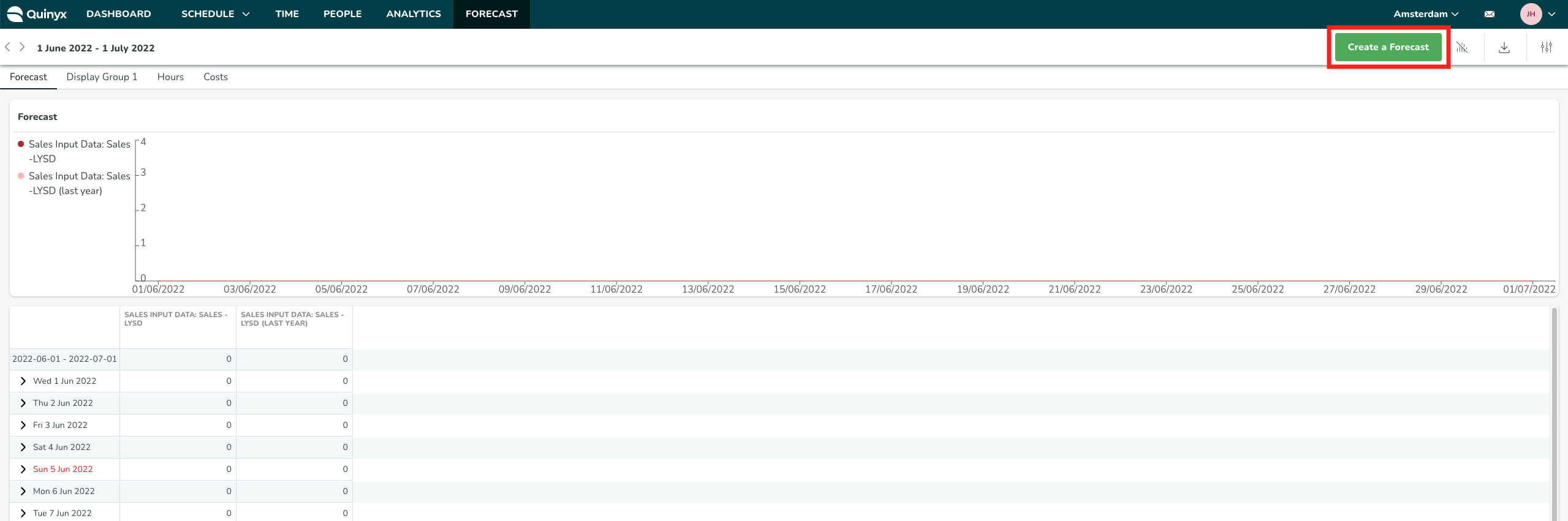
Create a Forecast
If you have purchased the Quinyx AI Demand Forecasting module, you will have access to an option called Create a Forecast which can be used to manually run the AI Demand Forecasting module for a specific time frame and group.
You will receive a status message indicating that the forecasting process has started. You will also receive a status message indicating whether the forecasting process is complete and for how many variables forecasts were created.
Editing forecast data
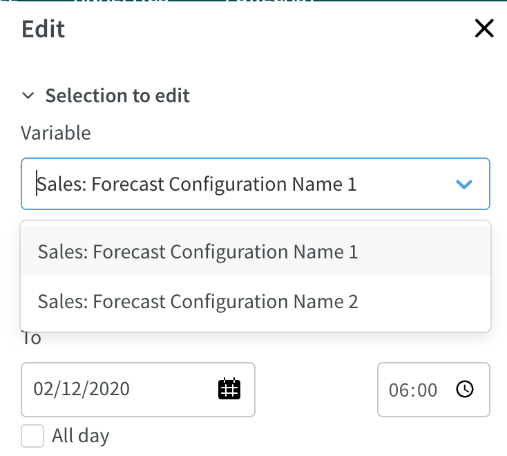
When you click on a forecasted data point for a future date, this will open the Edit panel. This panel is divided into two sections.
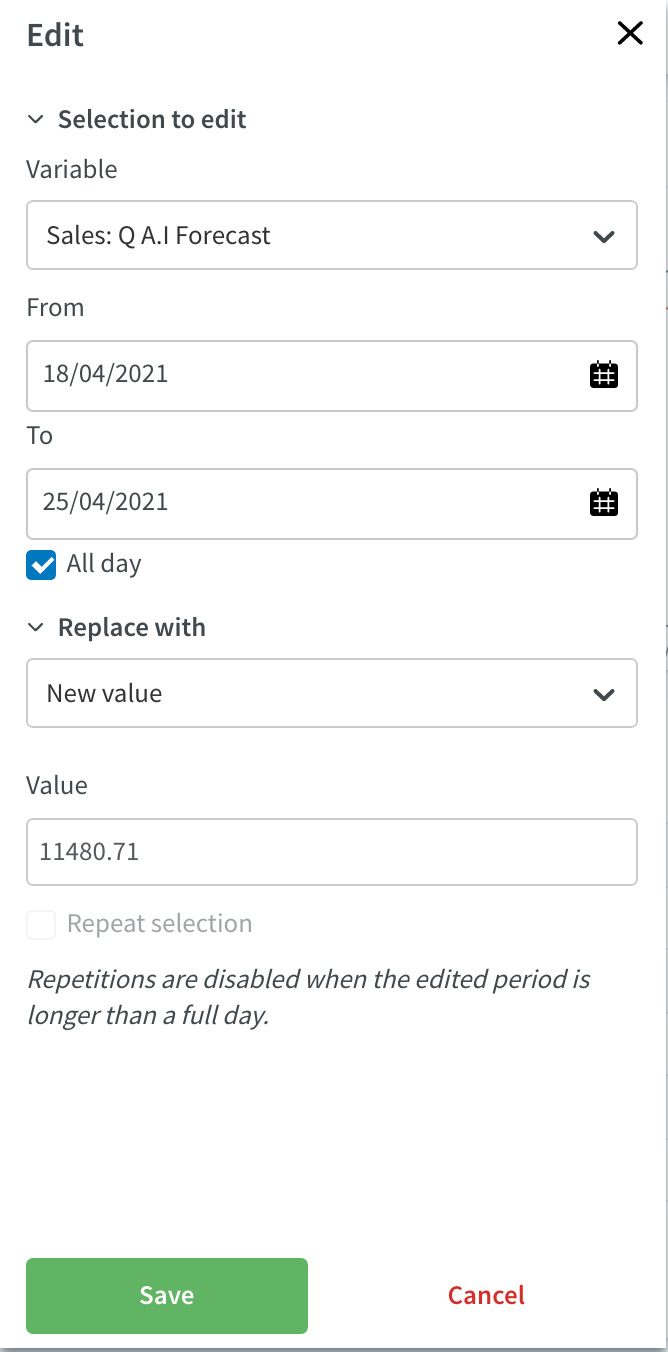
1. Selection to edit
Here you can select which variable and date range you want to edit data for. i.e. What do you want to edit?
If All day is unticked, you're able to select specific times during the day you want to edit data for.
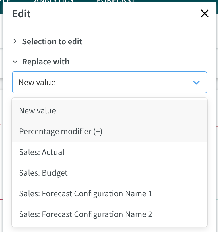
2. Replace with
Now that you've selected what you want edit you can use this section to create the new value.
In the drop-down box, you'll see some predefined options, including the ability to replace the data with:
- A new, manually entered value.
- A percentage modifier eg., +10% or -10% of the existing value.
- Actual data from a historical date range.
- Budget data from a specified date range.
- Data from another forecast configuration.
Clicking Save will apply your edit.
2a. Repetition
If you've selected a single day, you have the option to repeat your edit every x-week until a specified end date.
You can also select which specific days you want this edit to occur.
Click Save to apply your edit.
Comparison mode
Using comparison mode, you are able to compare a single variable across up to 10 different units. Comparison is only currently supported on a unit level.
To enter comparison mode, click Adjust View, then select Comparison from the Show drop-down list.
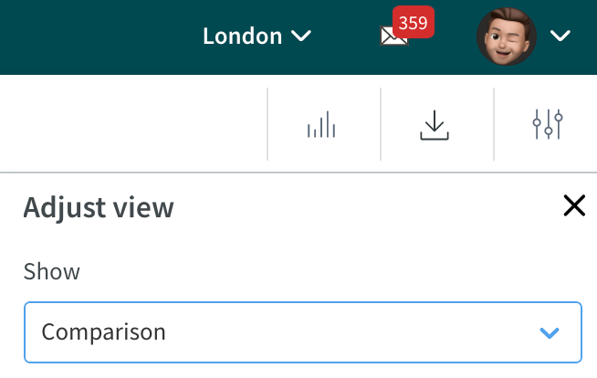
Once you have changed to Comparison mode, you will see additional options appear in the list below.
- Select which variable to compare - you will be able to select a single variable to compare across all units
- Units - you will be able to select up to 10 units.
- Start date & end date
- Show aggregated values by - day, week, or month, similar to the aggregation options you can use in Overview mode.
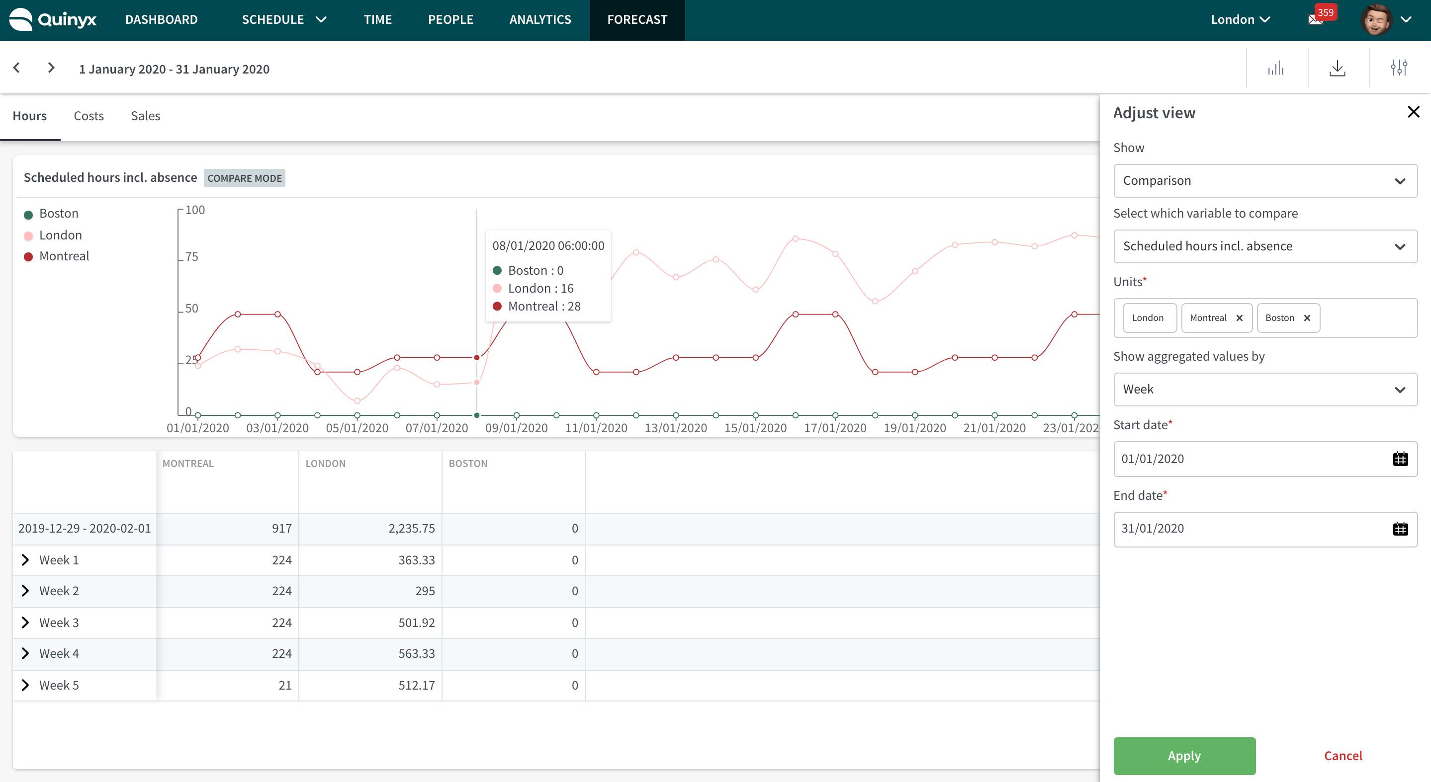
Once you have made your selection, you will be able to see your selected units in both the graph and table view. You can turn off/on a particular unit from the graphical view by clicking on its name in the graph.
You are still able to edit a particular unit's input data within compare mode.