Advanced Analytics - Pulse Dashboards
 Updated
by
Daniel Sjögren
Updated
by
Daniel Sjögren
Introduction
The Pulse Dashboards provide a clear and comprehensive overview of how employees engage with pulse surveys across your organisation. These dashboards help you track survey reach, response behaviour, answer quality, and engagement across units, districts, sections, and even individual survey questions.
Pulse dashboards are designed for end users—such as managers, HR partners, and operational leads—who need quick, actionable insights into team sentiment and survey participation.

How it works
The Pulse Dashboard is divided into three key analytical views:
- Overview – a high-level summary of all pulse survey activity
- Hierarchy View – a deeper view organised by organisational structure
- Question View – analysis focused on individual survey questions
All views support extensive filtering, exporting, and drill-down capabilities.
Overview Tab
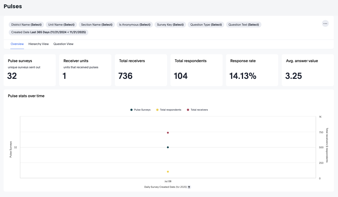
The Overview tab provides headline metrics and a snapshot of pulse survey activity across your selected time range and filters.
Headline Metrics
- Pulse surveys: total unique surveys sent
- Receiver units: number of units that received surveys
- Total receivers: total number of people who received surveys
- Total respondents: number of employees who responded
- Response rate: percentage of receivers who responded
- Avg. answer value: the average score/value from all question responses
These values give an instant sense of survey reach and engagement strength.
Pulse Stats Over Time
This visual shows how pulse activity changes over time, including:
- Pulse surveys sent
- Total respondents
- Total receivers
Useful for spotting seasonal spikes, engagement drops, or responses to initiatives.
Available Options in the Overview Tab
- Filters
Available filters in this tab include:
- District Name
- Unit Name
- Section Name
- Is Anonymous
- Survey Key
- Question Type
- Question Text
- Created Date
These allow you to slice your data by:
- Organisational level
- Specific surveys
- Only anonymous responses
- Specific questions/themes
- Time windows
- Three-dot Menu Actions
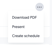
- Download PDF: Export the current view for reporting
- Present: Open a presentation-friendly mode, ideal for meetings
- Create schedule: Automate delivery of this dashboard to stakeholders
Hierarchy View Tab
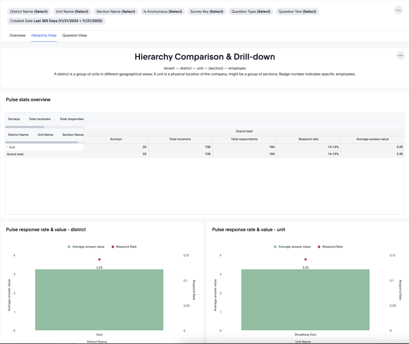
The Hierarchy View breaks down pulse survey engagement by organisational layers:
- Tenant
- District
- Unit
- (Section)
- Employee
This structure helps you compare performance across your hierarchy.
Pulse Stats Overview Table
This table shows:
- Total surveys
- Total receivers
- Total respondents
- Response rate
- Average answer value
Values are summarised by District → Unit → Section, giving a clear comparison across organisational groups.
Pulse Response Rate & Value – District
A visual comparison of:
- Average answer value (sentiment or score)
- Respond rate (engagement)
This highlights which districts have:
- High satisfaction but low participation
- High participation but low satisfaction
- Balanced, high-performing teams
Pulse Response Rate & Value – Unit
Same as above, but filtered to unit-level. Useful for identifying standout or struggling units.
Available Options in Hierarchy View
- Drill down: Expand rows from district → unit → section
- Filter panel: Same organisational and survey filters as Overview
- Sort columns: Reorder by response rate, answer value, or respondents
- Export / PDF / Schedule: via 3-dot menu
Question View Tab
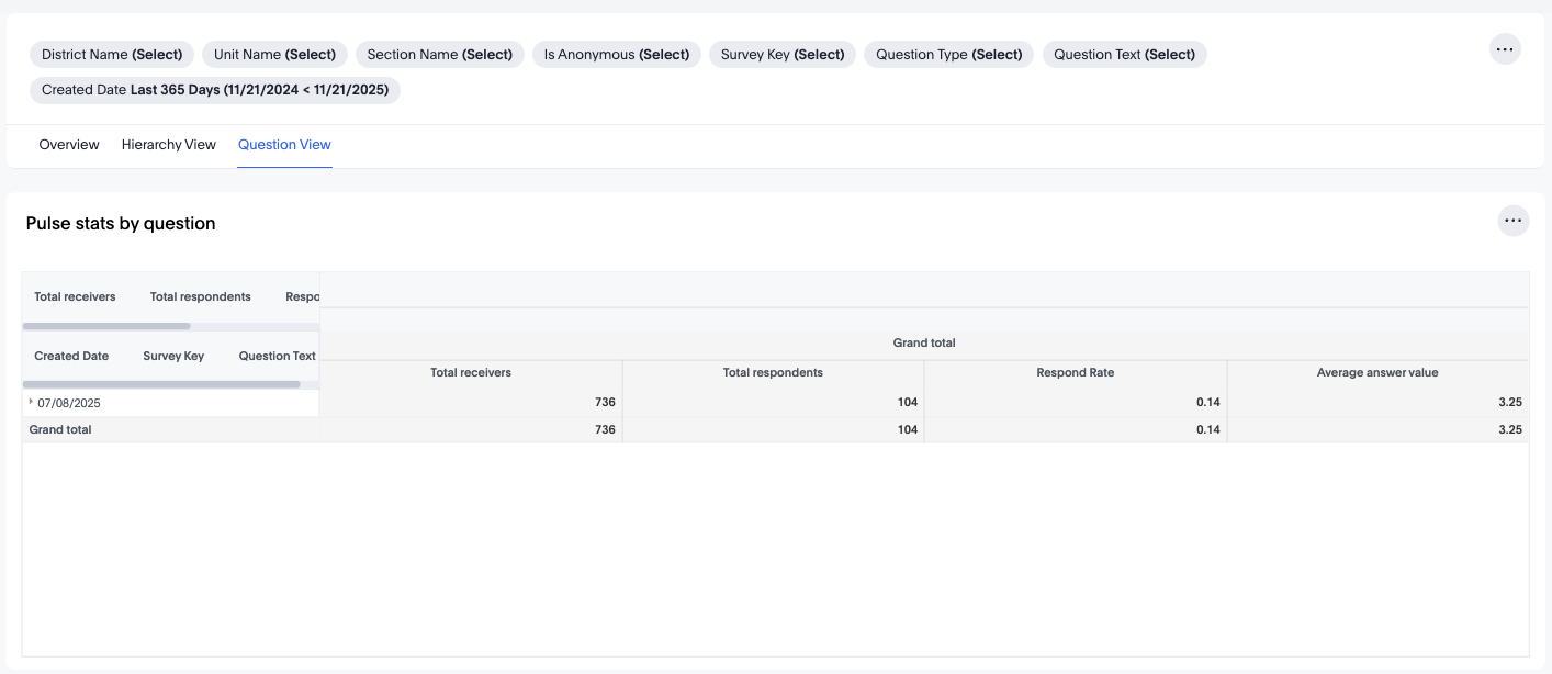
The Question View focuses on survey content itself, allowing you to analyse individual questions rather than the survey as a whole.
Pulse Stats by Question Table
This table breaks down each question by:
- Total receivers
- Total respondents
- Response rate
- Average answer value
- Created date
- Survey key
- Question text
This helps you identify:
- Which questions or topics employees respond to most
- Which questions result in lower responses (possible fatigue or sensitivity)
- Areas needing further follow-up or deeper exploration
Available Options in Question View
- Filter by Question Text: Narrow down specific topics
- Filter by Question Type: e.g., rating, open text, multiple choice
- Filter by Survey Key: Focus on specific surveys
- Export results for reporting, audits, or communication
- Three-dot menu actions (PDF, Present, Create schedule)
Practical Use Cases
- Monitor Engagement Health
Track how many employees respond to pulse surveys and how engaged each unit is.
- Identify At-Risk Teams
Low response rates or low average answer values at district or unit level may indicate morale issues.
- Compare Teams Over Time
Use trend data to assess improvement or decline following organisational changes, new policies, or leadership shifts.
- Analyse Question-Level Trends
Identify which questions consistently receive:
- Low participation
- Low scores
- High variability
These often represent important improvement areas.
- Support HR and Leadership Decisions
Export or present insights to leadership to guide:
- Engagement initiatives
- Policy reviews
- Organisational changes
- Communication strategies
- Automate Reporting
Use "Create schedule" to send recurring monthly or weekly engagement snapshots to managers, HRBPs, or directors.
Conclusion
The Pulse Dashboards offer a full suite of tools for understanding employee sentiment, identifying engagement strengths and gaps, and supporting data-driven leadership decisions. With flexible filtering, organisational drill-downs, question-level insights, and export features, the dashboard empowers you to gain meaningful insight into how your teams feel and respond.