Introduction to Advanced Analytics
 Updated
by
Daniel Sjögren
Updated
by
Daniel Sjögren
Introduction
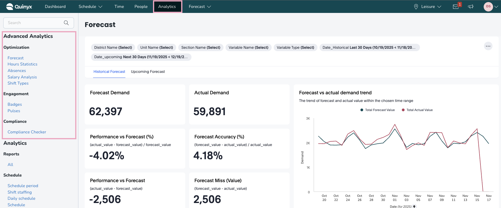
Advanced Analytics offers a set of dashboards for you to visualize and analyze your WFM-related data to see trends across your business. The dashboards are found under the Analytics tab within Quinyx:

To be able to access Advanced Analytics, you must have the Advanced Analytics module activated for your organization. If you are unable to see these dashboards, please contact your account representative.
The dashboards are broken down into three main categories:
- Optimization: These dashboards are focused on core WFM metrics such as scheduling, absences, and costs.
- Compliance: These dashboards are focused on helping businesses check their compliance adherence.
- Engagement: These dashboards are focused on helping businesses understand the engagement level of their workforce.
Once you’ve set permissions, go to the Analytics tab, and you should have the relevant module live:
KPI Dashboards
Optimization
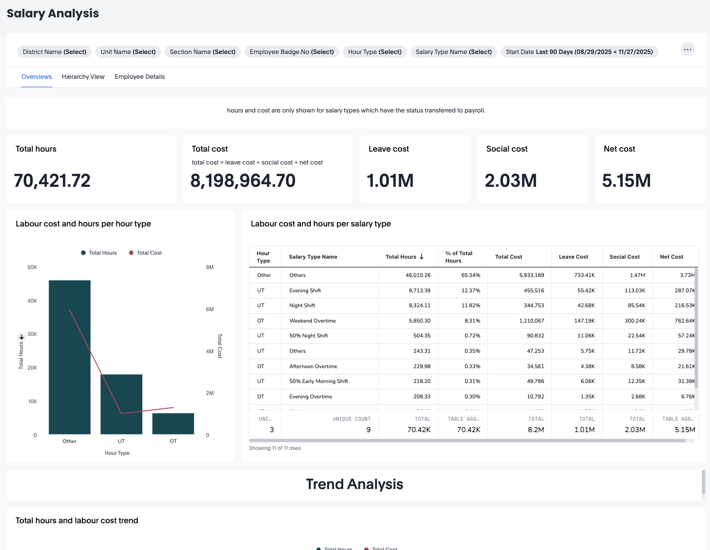
Salary Analysis
The Salary Analysis Dashboard provides a complete overview of labour hours and labour-related costs across your organisation. It enables managers, payroll teams, and operational leaders to analyse trends in cost, compare salary types, and drill down to unit, section, or individual employee levels.This dashboard is especially useful for understanding:
- Total hours worked
- Total calculated labour cost
- Distribution of costs by hour type and salary type
- Trends in hours and cost over time
- Detailed employee-level cost and hour breakdowns
OT Codes: 1030, 1031, 1032, 1033, 1034, 1090, 1091, 1092, 1093, 1094, 1180, 1181, 1182, 1183, 1184, 1185, 1186, 1187, 1188, 1189, 1190, 1191, 1192, 1193, 1194, 1195
UT Codes: 1050, 1051, 1052, 1053, 1054, 1055, 1056, 1057, 1110, 1111, 1112, 1113, 1114, 1115, 1116, 1117, 1140, 1141, 1142, 1143, 1144, 1145, 1146, 1147, 1170, 1171, 1172, 1173, 1174, 1175, 1176, 1177, 1200, 1201, 1202, 1203, 1204, 1205, 1206, 1207, 1210, 1211, 1212, 1213, 1214, 1215, 1216, 1217, 1220, 1221, 1222, 1223, 1224, 1225, 1226, 1227
Custom Codes: Anything else you add yourself.
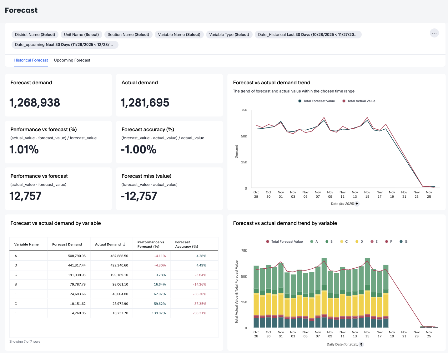
Forecast
The Forecast dashboard provides a detailed comparison between forecasted demand and actual demand, giving operational teams clear insight into forecast accuracy, variable-level performance, and predictive confidence ranges. It supports both historical forecast analysis and upcoming forecast projections, enabling data-driven staffing and planning decisions.The dashboard is divided into two main modes:
- Historical forecast – Compare past forecasts versus actual performance
- Upcoming forecast – Review demand predictions with confidence ranges
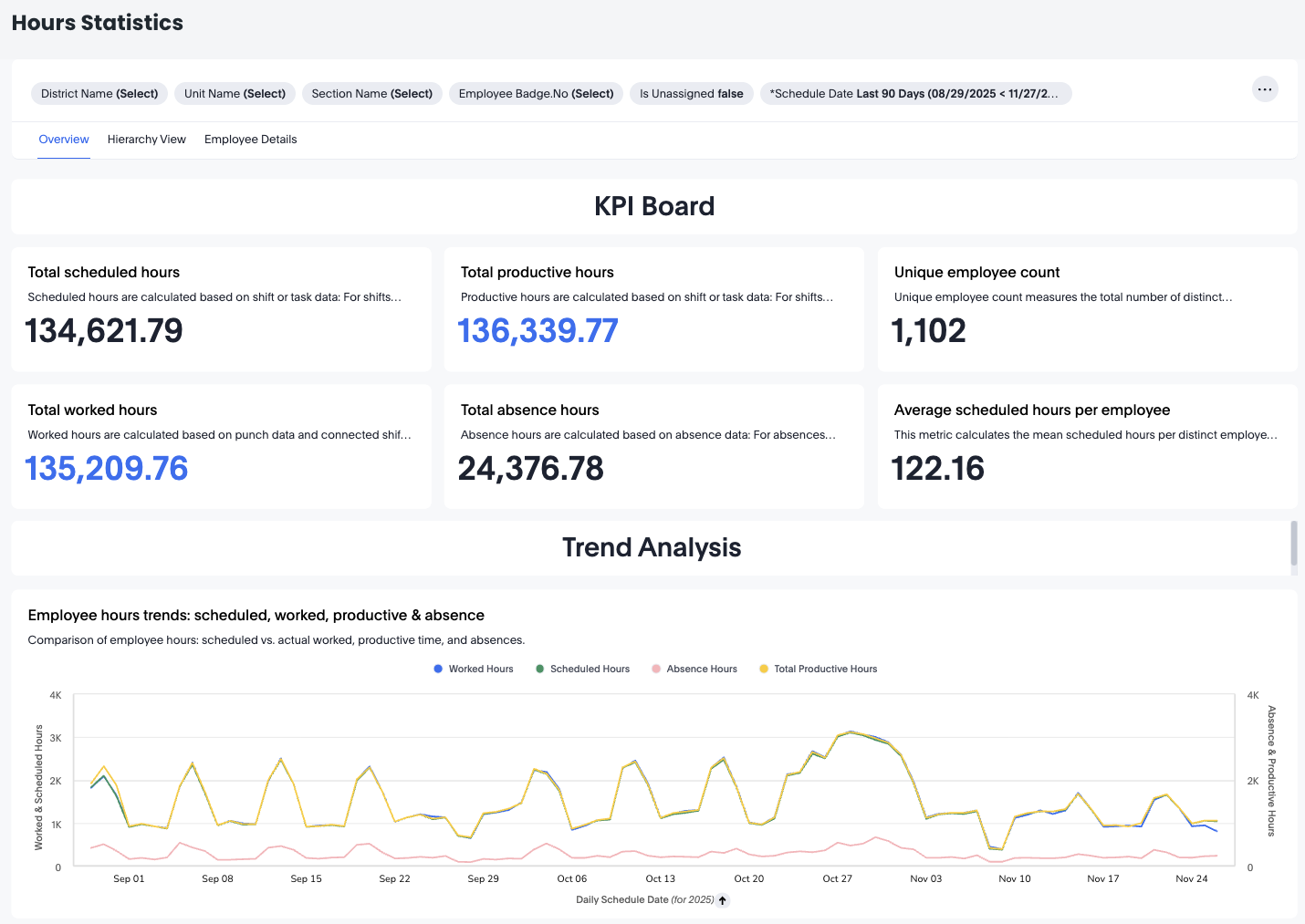
Hours Statistics
The Hours Statistics dashboard provides a complete overview of how your organization’s workforce hours are planned, worked, and utilized. It is designed to give end users—such as schedulers, planners, operational managers, and team leaders—a clear and intuitive understanding of daily and long-term labor performance.
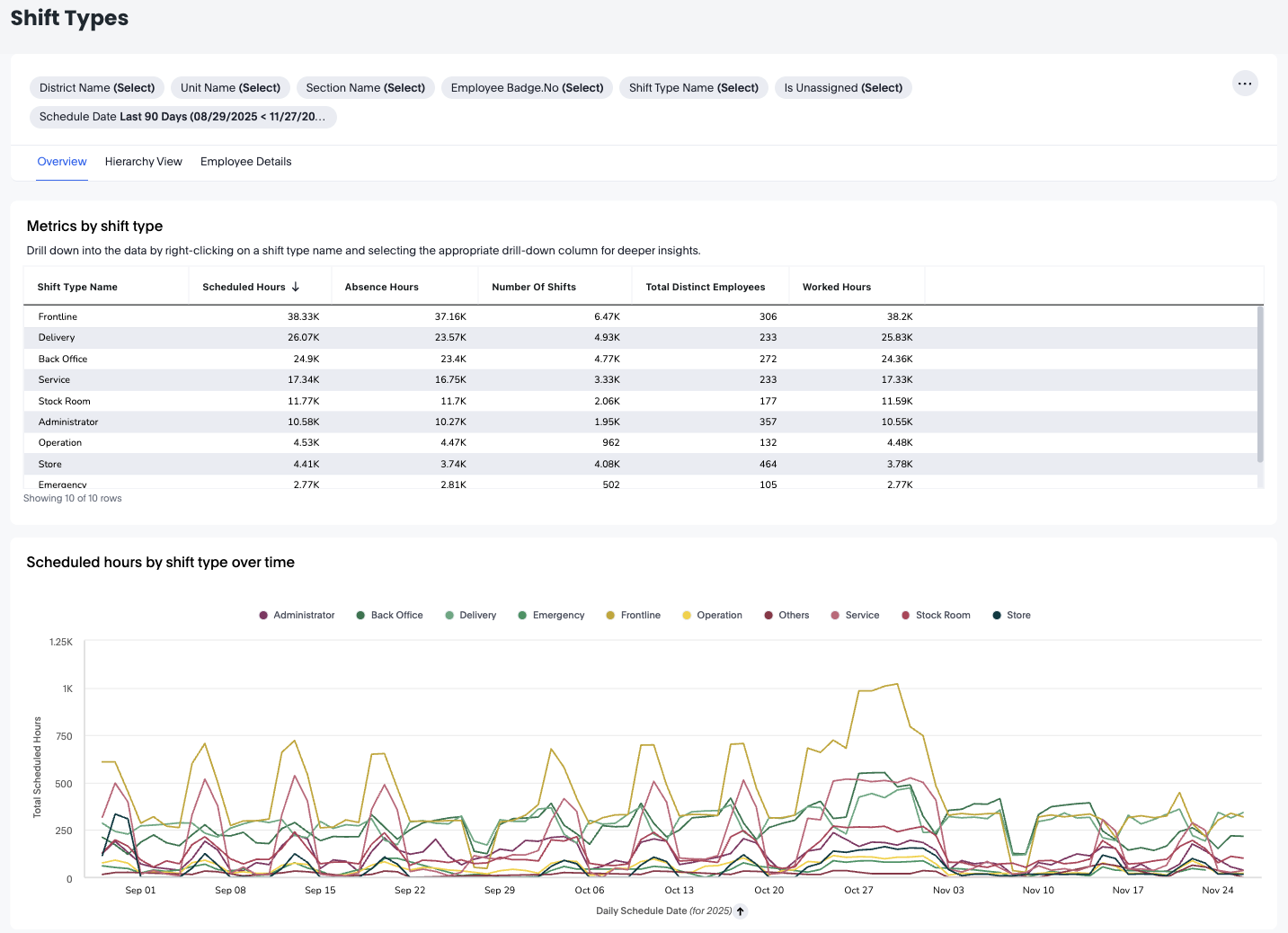
Shift types
The Shift Types Dashboard offers a detailed overview of how different shift types contribute to scheduled hours, worked hours, and absence hours within your organisation. This dashboard is especially helpful for operational managers, workforce planners, and HR partners who want to understand how frontline and administrative shift types are distributed across units, sections, and employees.
With organisational drill-downs, time-series analysis, and employee-level details, the Shift Types Dashboard helps you optimise staffing plans, evaluate workload distribution, and improve scheduling accuracy.
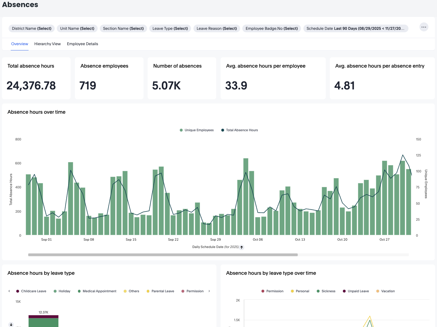
Absences
The Absences Dashboard provides a complete overview of employee absence patterns across your organization. It allows you to track total absence hours, understand absence types and reasons, explore trends over time, and drill down into detailed information at unit, section, or employee level.
Engagement
Badges
The Badges Dashboard gives you a complete view of how recognition is being shared across your organisation. It allows you to analyse who is sending badges, who is receiving them, which badge types are most commonly used, and how recognition activity evolves over time.
This dashboard helps leaders strengthen engagement by identifying recognition patterns, highlighting active contributors, and uncovering areas where encouragement may be needed.
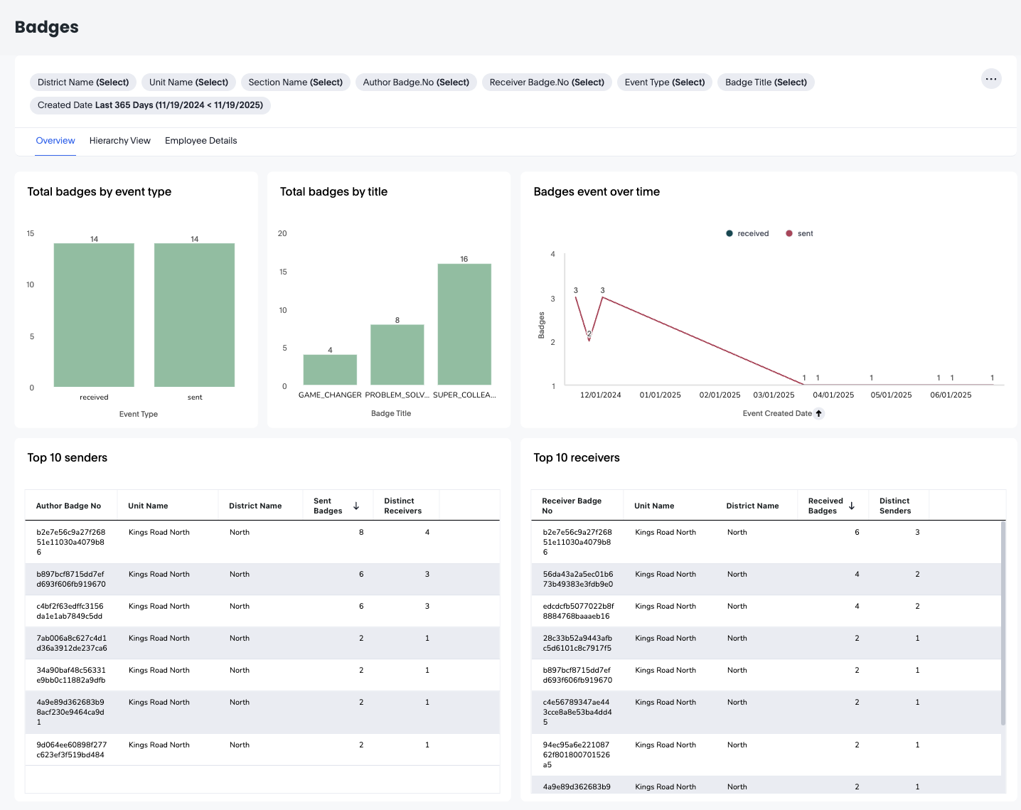
You'll be able to see the number of badges sent, badges sent over time, the top 10 senders, and the top 10 receivers.
Via the top dashboard widget, you can refresh the page, you can hide the filters you've selected, and you can choose to download, schedule delivery, reset the filters, and you can change the dashboard's time zone.
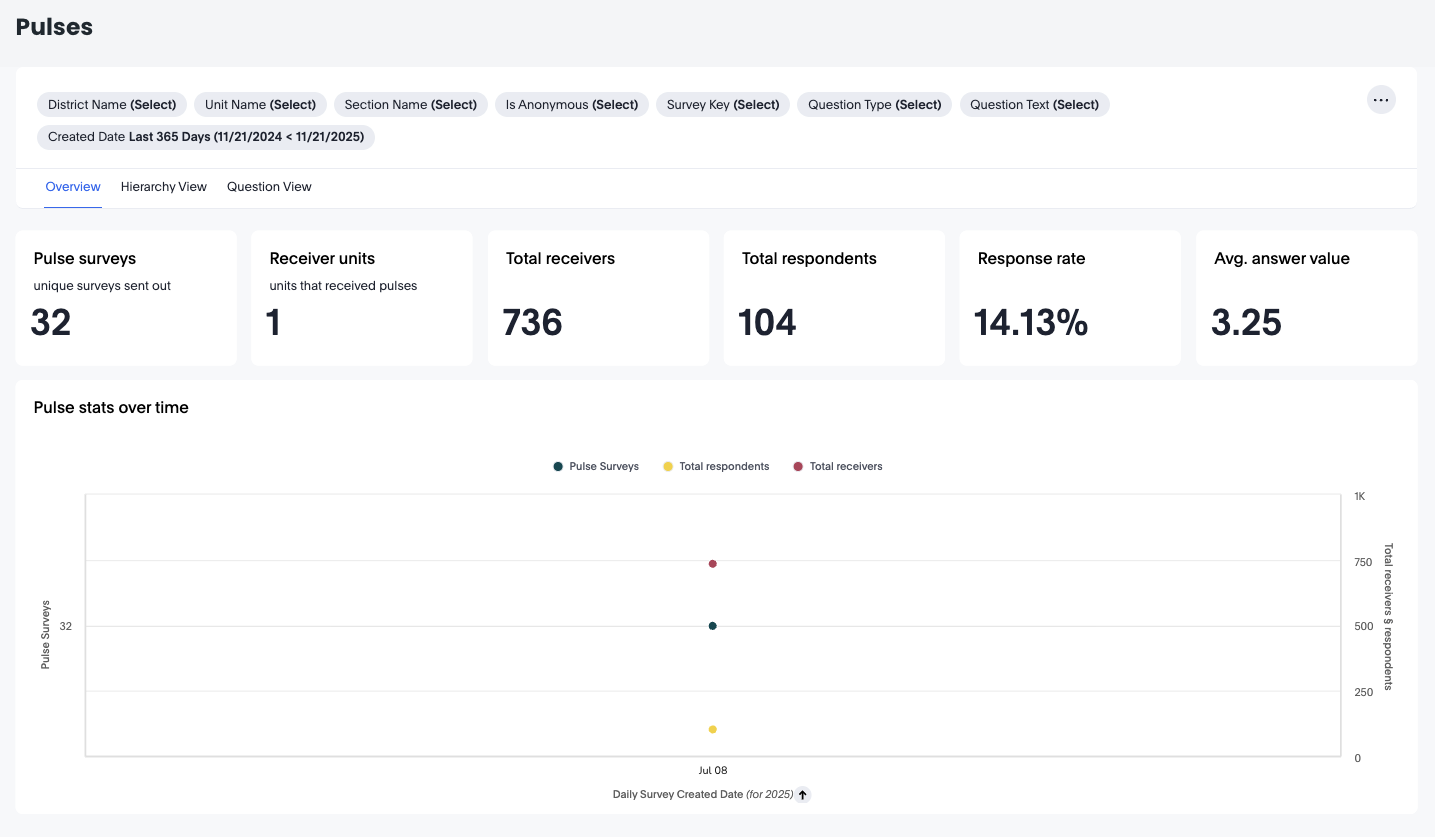
Pulses
The Pulse Dashboards provide a clear and comprehensive overview of how employees engage with pulse surveys across your organisation. These dashboards help you track survey reach, response behaviour, answer quality, and engagement across units, districts, sections, and even individual survey questions.
Pulse dashboards are designed for end users—such as managers, HR partners, and operational leads—who need quick, actionable insights into team sentiment and survey participation.
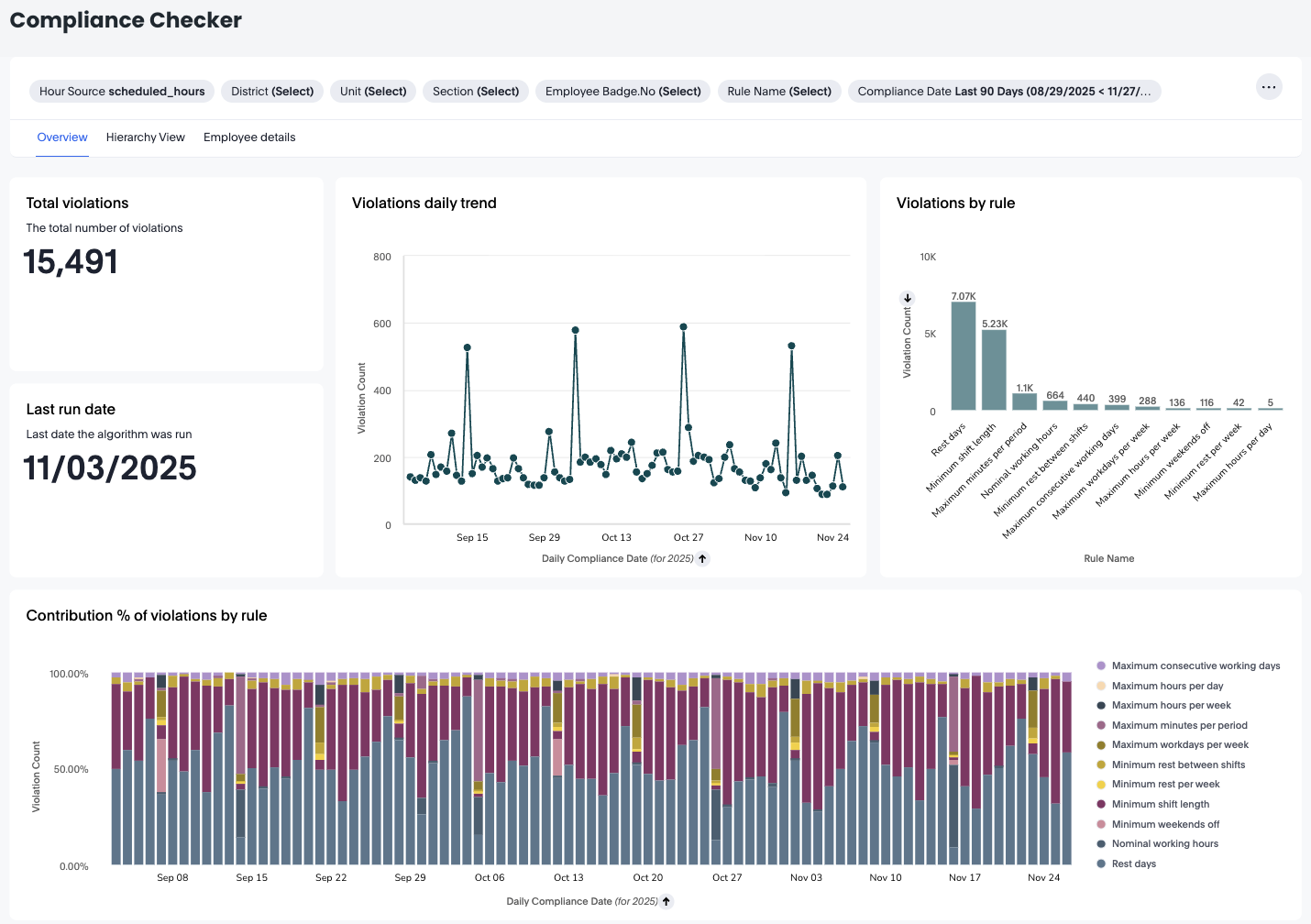
Compliance checker
The Compliance Checker is a practical tool that provides Quinyx users with immediate insights into scheduling adherence. It flags any non-compliance by comparing schedules against customer-defined rules, highlighting discrepancies with details such as unit, employee ID, employee name, rule name, and the date of the violation. Its interactive design enables users to filter results by clicking on elements within the tables, focusing on particular rules, units, employees, or dates for a more targeted review.