Advanced Analytics - Hours statistics dashboard
 Updated
by
Daniel Sjögren
Updated
by
Daniel Sjögren
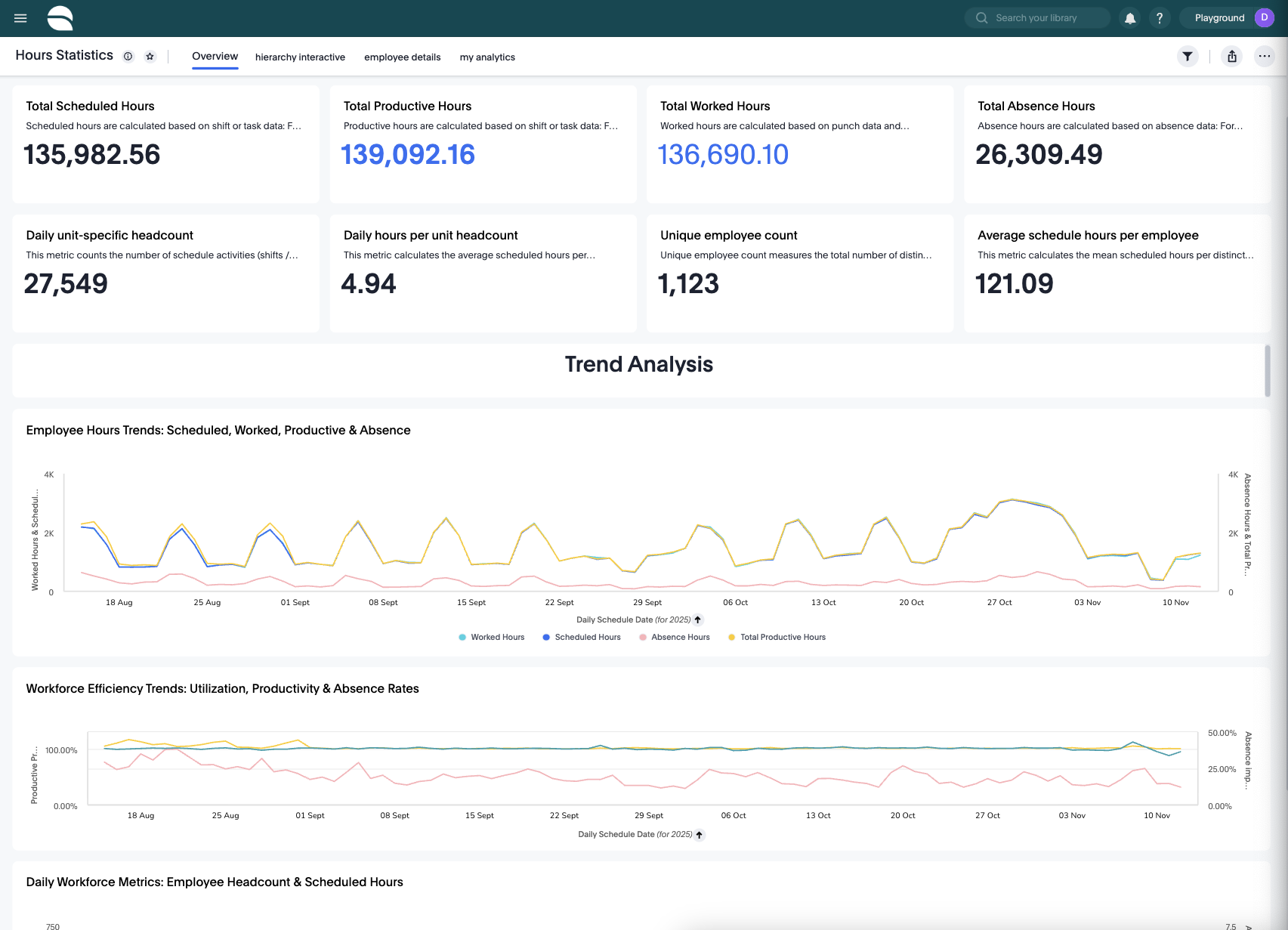
Introduction to the Hours Statistics Dashboard
The Hours Statistics dashboard provides a complete overview of how your organization’s workforce hours are planned, worked, and utilized. It is designed to give end users—such as schedulers, planners, operational managers, and team leaders—a clear and intuitive understanding of daily and long-term labor performance.
Through a combination of KPI tiles, visual trend graphs, customizable analytics, and flexible drill-down options, the dashboard allows you to:
- Monitor total and productive labor hours
- Spot inefficiencies across scheduled vs worked hours
- Identify absence patterns
- Compare performance across units, districts, or teams
- Investigate down to the employee level
- Build custom analytics views using Explore Mode
How it works
The dashboard is organized into themed visual sections, each focusing on a different aspect of your workforce hours. Below you will find detailed descriptions of each analytics section, along with all available options and their functions.
Employee Hours Trends: Scheduled, Worked, Productive & Absence
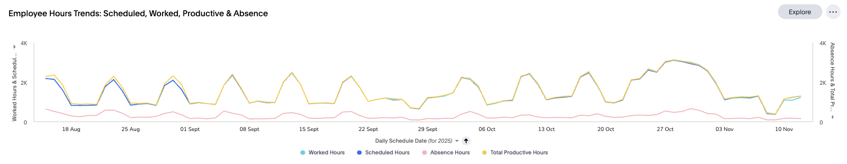
This section visualizes how your workforce’s scheduled, worked, productive, and absence hours develop over time. It is typically used to spot discrepancies between planned and actual work behavior.
What this dashboard shows
- Scheduled Hours – Hours planned in schedules
- Worked Hours – Hours recorded through punches
- Productive Hours – Hours counted as productive after rules are applied
- Absence Hours – Hours logged as absence
Together, these values help you assess whether staffing levels match operational reality.
Workforce Efficiency Trends: Utilization, Productivity & Absence Rates
This dashboard focuses on efficiency ratios rather than absolute hours. It shows how effectively scheduled hours convert into worked or productive output.
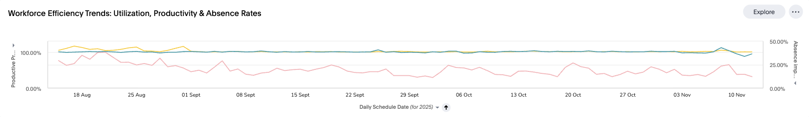
What this dashboard shows
- Schedule Utilization (%) – Worked vs Scheduled
- Productive Proportion (%) – Productive vs Scheduled
- Absence Impact (%) – Absence vs Scheduled
These help you understand operational efficiency, process adherence, and staffing effectiveness.
Daily Workforce Metrics: Employee Headcount & Scheduled Hours
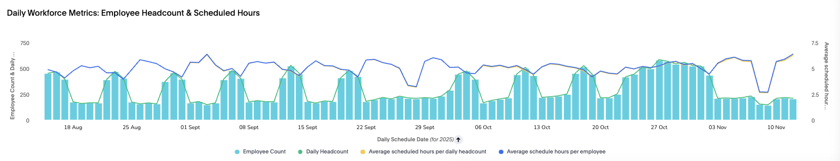
This dashboard focuses on staffing levels and workload distribution.
What this dashboard shows
- Employee Count – Unique employees active on a given day
- Daily Headcount – Number of shifts/tasks scheduled
- Average Scheduled Hours per Employee
- Average Hours per Headcount
This view is especially useful for assessing whether your staffing levels match operational demand on a per-day basis.
Extra Details
Metric | Definition |
Scheduled hours | Scheduled hours are calculated based on shift or task data: for shifts counted as scheduled hours, it is the shift duration minus non-working breaks based on agreements and settings; for task-based shifts, hours are added or subtracted depending on task settings and whether breaks overlap. |
Productive hours | Calculated based on shift or task data: for shifts counted as productive hours, it is the shift duration minus non-working breaks based on agreements and settings; for task-based shifts, hours are added or subtracted depending on task settings and overlapping break behavior. |
Worked hours | Calculated based on punch data and connected shift data. Only punches counted as worked are used. Hours are split for overnight shifts and break rules are applied based on agreements/settings. |
Absence hours | Calculated based on absence data. Absence hours exclude non-working breaks and follow the same task/break logic as shifts when applicable. |
Daily unit-specific headcount | Counts the number of schedule activities (shifts/tasks) per day in the selected unit(s). |
Daily hours per unit headcount | Average scheduled hours per distinct scheduled activity per day. |
Unique employee count | Total number of distinct employees active during the selected period. |
Average scheduled hours per employee | Mean scheduled hours per employee within the selected period. |
Practical Use Cases
- Identify Scheduling Gaps
If worked hours consistently fall short of scheduled hours, investigate over-scheduling or low adherence.
- Detect Absence Trends
An increase in Absence Impact (%) combined with high Absence Hours can signal local staffing challenges.
- Evaluate Productivity
Use productive proportion trends to see whether productivity improves or declines following schedule changes.
- Benchmark Units
Using Compare, you can contrast units, districts, or teams to find best practices.
- Support Payroll Review
Download underlying worked hour data directly for reconciliation.
- Prepare Regular Reports
Pin customized charts, export as needed, or combine them to create weekly performance packs.
Conclusion
The Hours Statistics dashboard is a powerful analytics tool that provides complete visibility into your workforce’s planning, attendance, and productivity. With rich trend charts, flexible Explore Mode options, and intelligent insight features, it enables operational leaders to make informed decisions and optimize workforce performance.