Advanced Analytics - Filters and available dashboard actions
 Updated
by
Victor Jespersen
Updated
by
Victor Jespersen
Available Filters
The following filters are commonly available across Quinyx Advanced Analytics dashboards. Not every dashboard includes every filter, but this table summarises their purpose and usage.
Filter Category | Filter Name | What It Does | When to Use It | What dashboard |
Organisational Structure | ||||
District Name | Limits data to selected districts. | Comparing regions or focusing on specific areas. | All | |
Unit Name | Filters results by unit/store. | Reviewing or comparing unit performance. | All | |
Section Name | Filters by department/section. | Drilling into specific departments or teams. | All | |
Employee-Level | ||||
Employee Badge No / Employee Key / ID | Filters for specific employees. | Individual reviews or compliance checks. | Absences, Hours statistics, Salary analysis, Shift types | |
Is Unassigned | Shows or hides unassigned records. | Data cleaning or identifying configuration gaps. | Shift types | |
Time-Based | ||||
Schedule Date / Created Date | Defines the period of data displayed. | Analysing trends for specific periods. | Absences, Hours statistics, Shift types | |
Predefined Ranges | Applies common ranges (e.g., Last 90 days). | Quick analysis of recent performance. | All | |
Custom Date Range | Lets you choose an exact date window. | Comparing custom time periods. | All | |
Data Type / Classification | ||||
Leave Type | Filters by major leave categories. | Identifying high-level absence drivers. | Absences | |
Leave Reason | Filters detailed absence reasons. | Root-cause absence analysis. | Absences | |
Shift Type Name | Filters by shift category (e.g., Frontline). | Reviewing shift distribution. | Shift types | |
Salary type name | Filters by salary type (e.g., Weekend overtime). | Compare or analyse specific pay categories; identify cost impact or behaviour tied to particular salary rules. | Salary analysis | |
Hour type | Filters by hour type (e.g., OT, UT, etc.) | Reviewing pay-impacting hours, analysing overtime behaviour, or ensuring accurate classification of worked hours. | Salary analysis | |
Variable name | Filters by variable name. | Focusing on one particular variable component (e.g., bonus, supplement, allowance) to understand its contribution. | Forecast | |
Variable type | Filters by variable type | Comparing variable groups, validating salary model configuration, or isolating specific types of pay drivers (e.g., multipliers vs fixed allowances). | Forecast | |
Rule name | Filters by compliance rule(s) | Checks compliance levels after set up schedule compliance rules | Compliance checker. | |
Survey & Engagement | ||||
Survey Key | Filters to a specific pulse survey. | Analysing one survey instance. | Pulses | |
Question Type | Filters by question format. | Understanding response patterns. | Pulses | |
Question Text | Filters to a specific question. | Topic-based analysis. | Pulses | |
Is Anonymous | Includes/excludes anonymous responses. | Comparing anonymous vs non-anonymous trends. | Pulses | |
Event Type (Sent / Received) | Filters badge/recognition events by direction. | Understanding recognition behaviour. | Badges | |
Badge Title / Badge Type | Filters by badge category. | Reviewing recognition by behaviour type. | Badges |
Global available actions (three-dot menu)

The three-dot menu in the top filter section of all dashboards allows you to:
- Download PDF: Export the current dashboard tab into a PDF report for sharing or documentation.
- Present Mode: Launch a clean, presentation-friendly version perfect for meetings.
- Create schedule: Automate recurring dashboard exports and send reports to predefined recipients (e.g., weekly or monthly summaries).
Module-based actions (three-dot menu)
Inside each dashboard there are individual modules/widgets that you can interact with:
- Show underlying data: Viewing the underlying data of your answer gives you an un-aggregated view of the underlying data. You can see the most granular details of a given result set, the un-aggregated view.
This feature lets you understand what an answer consists of. For example, if you search for customer region revenue, the answer shows the aggregate revenue value for each customer region. Then, you can right-click any row and then select Show underlying data, to see each value which constitutesrevenuefor any given region.
Only the first 1,000 rows appear when viewing the underlying data. You can even download the results shown when you choose Show underlying data from a chart. The download file limit is a million rows.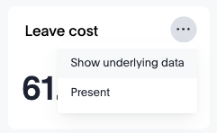
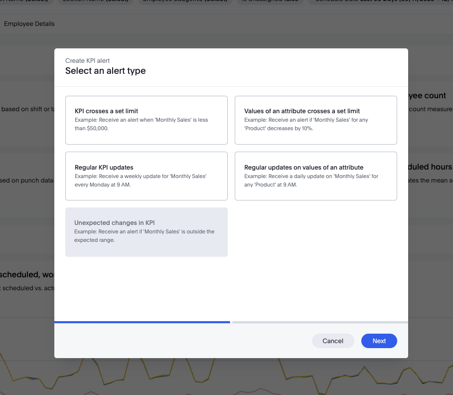
- Alerts: using our interactive alerts you can better surface insights for your employees, ensuring that the right people get the right information at the right time.
Using the 🔔 icon on any applicable insight, you can configure either time or event based triggers to update your target audience. For example - if you use the KPI crosses a set limit alert to define the alert condition, to send a notification when the KPI you're tracking exceeds, is equal to, or goes below a certain threshold. When configuring - you'll find four categories of alerts: anomaly alerts, threshold alerts, scheduled alerts and alerts by attribute
Download actions for modules
You can download different module reports in different formats, depending on which module it is. Here is a list of the download formats of each module:
- A data visualisation:
- PNG
- XLSX
- CSV
- A tabular report:
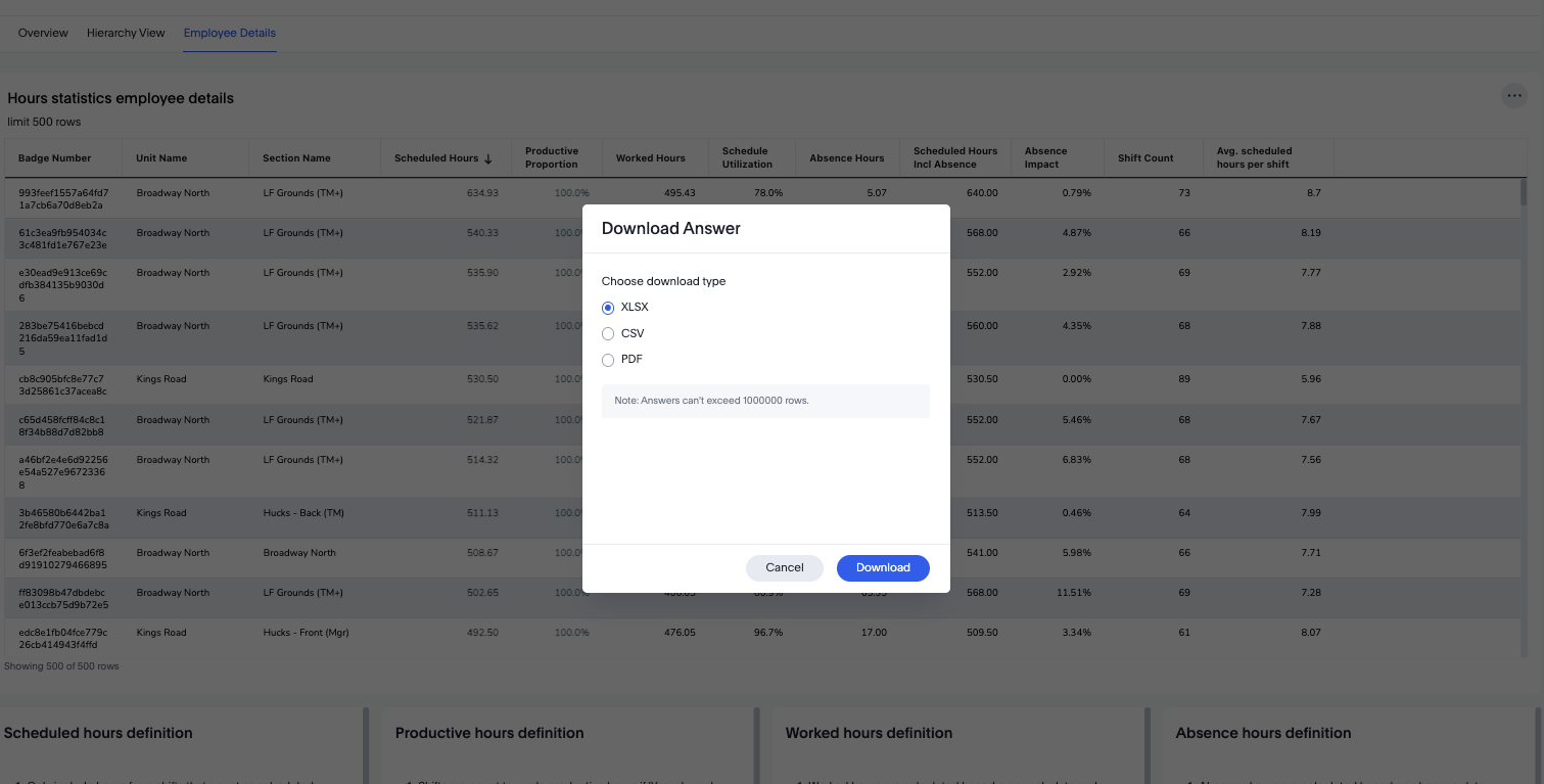
- XSLX
- CSV
- PDF/PNG
- The whole dashboard:
- A scheduled report
- XSLX
- CSV